Image 1 of 1: ‘ Venn diagram of a) a closed pangenome and b) an open pangenome, comparing the sizes of their core and accessory genomes. c) Graphic depicting the differences between closed and open pangenomes regarding their size, total genes in pangenome, and the number of sequenced genomes.’
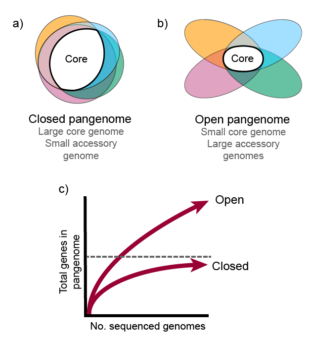
Image 1 of 1: ‘ Bidirectional best-hit algorithm’

Image 1 of 1: ‘Bar graph depicting the gene family frequency distribution, represented by a U-shaped plot. The number of organisms is plotted in the x-axis and the number of gene families in the y axis.’
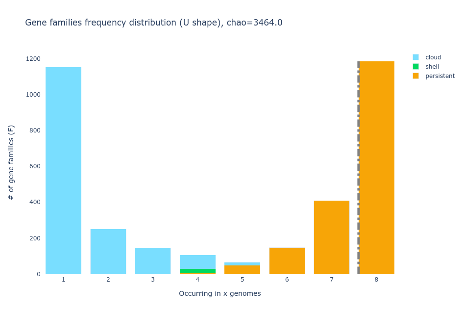
Image 1 of 1: ‘Tile plot displaying the gene families present within six strains of Streptococcus agalactiae, including the cloud gene families’
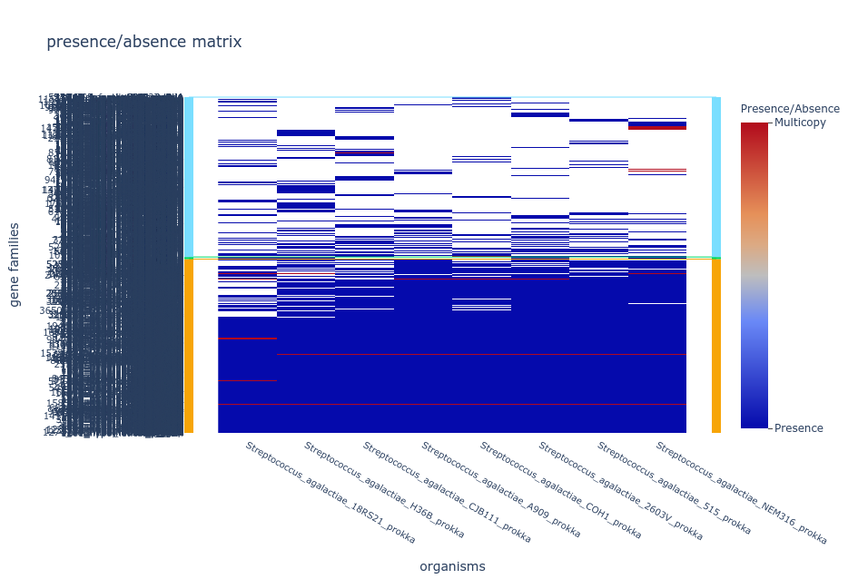
Image 1 of 1: ‘default Gephi visualization after layout specifications’
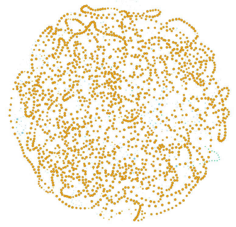
Image 1 of 1: ‘Gephi visualization with orange nodes for the persistent families, blue for cloud, and green for shell.’

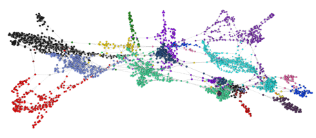
Image 1 of 1: ‘Gephi visualization with 8 different colors.’

Image 1 of 1: ‘Gephi visualization with the nodes colored according to the number of genes that are part of the family.’

Image 1 of 1: ‘Gephi visualization with all hypothetical proteins are in pink and the rest in gray.’

Image 1 of 1: ‘Interactive Anvio pan genome analysis of six S. agalactiae genomes.
Each circle corresponds to one genome and each radius represents a gene family. ’

Image 1 of 1: ‘Example of network made with Graphia. ’