All Images
Introduction to Genome Mining
Figure 1
Image 1 of 1: ‘Complete pipeline of genome mining. From a single genome, this example obtains their BGC and compares them with other BGC from related genomes’
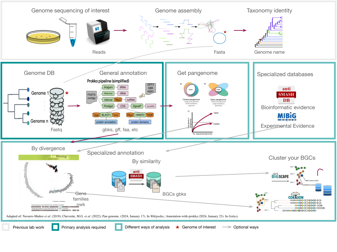
Figure 2
Image 1 of 1: ‘Natural products can be produced by bacteria, fungi, plants and animals’
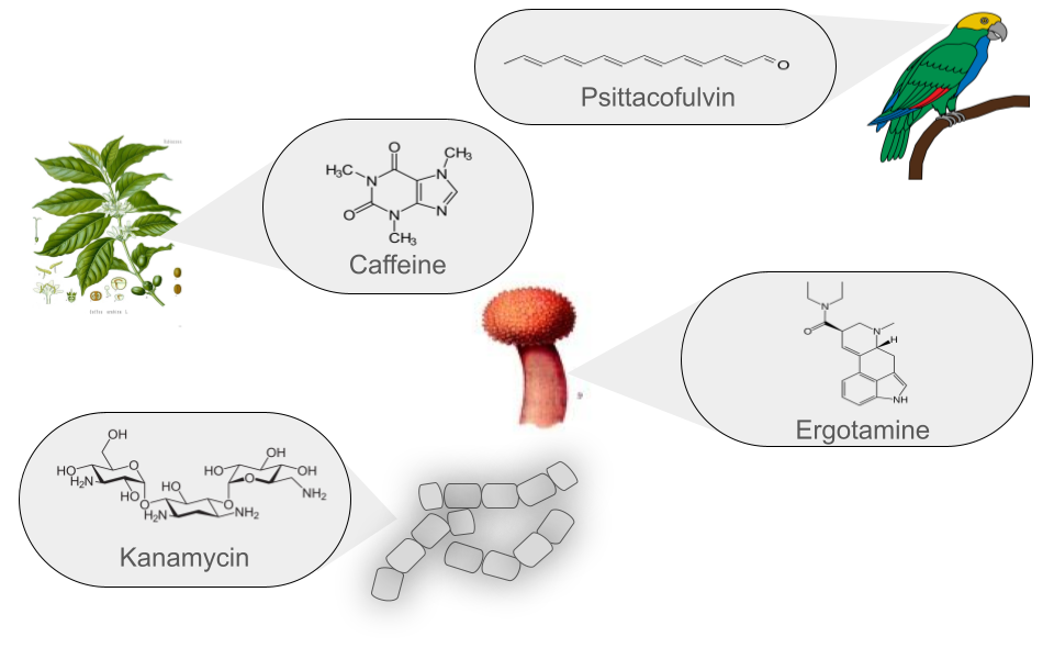
Figure 3
Image 1 of 1: ‘BGC arrange example’
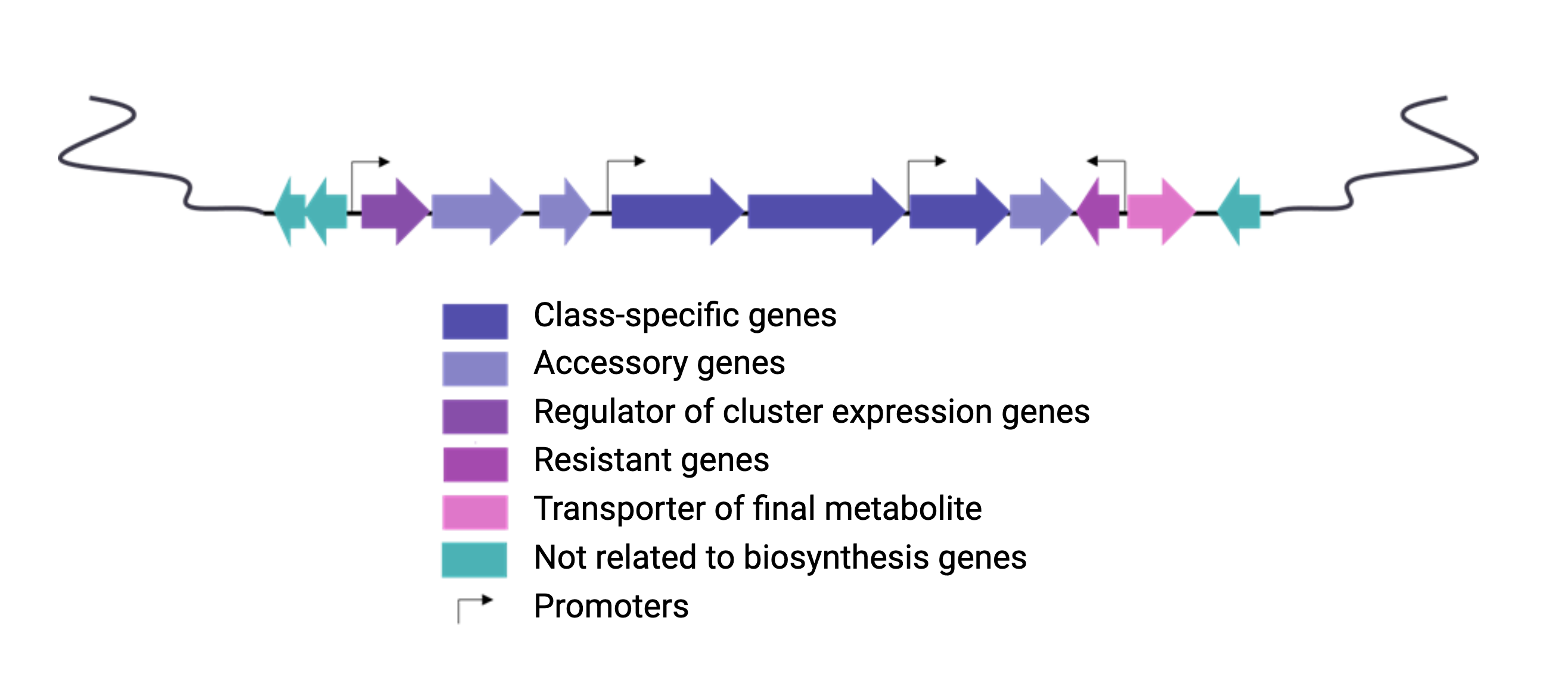
Figure 4
Image 1 of 1: ‘NRPS animation of fakeomycin’
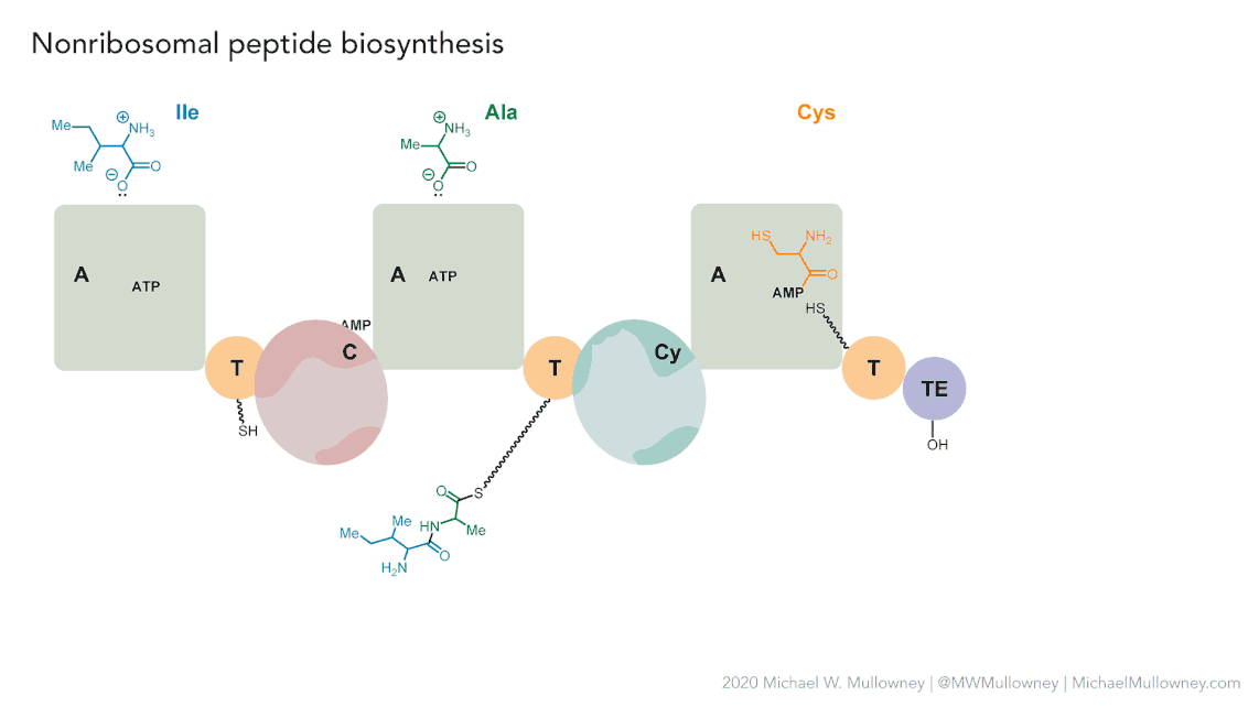
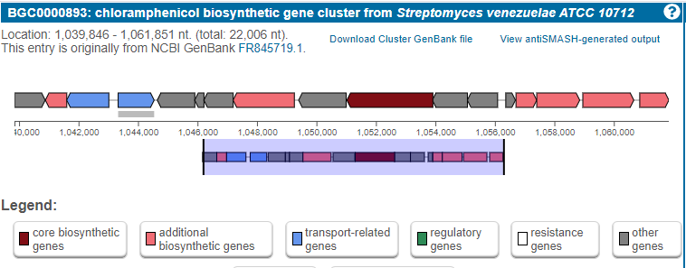
Figure 5
Image 1 of 1: ‘MIBiG layout of the Chloramphenicol gene cluster from _Streptomyces venezuelae_ comprising 17 genes’
Secondary metabolite biosynthetic gene cluster identification
Genome Mining Databases
Figure 1
Image 1 of 1: ‘MIBiG website homepage highlighting the search tool’
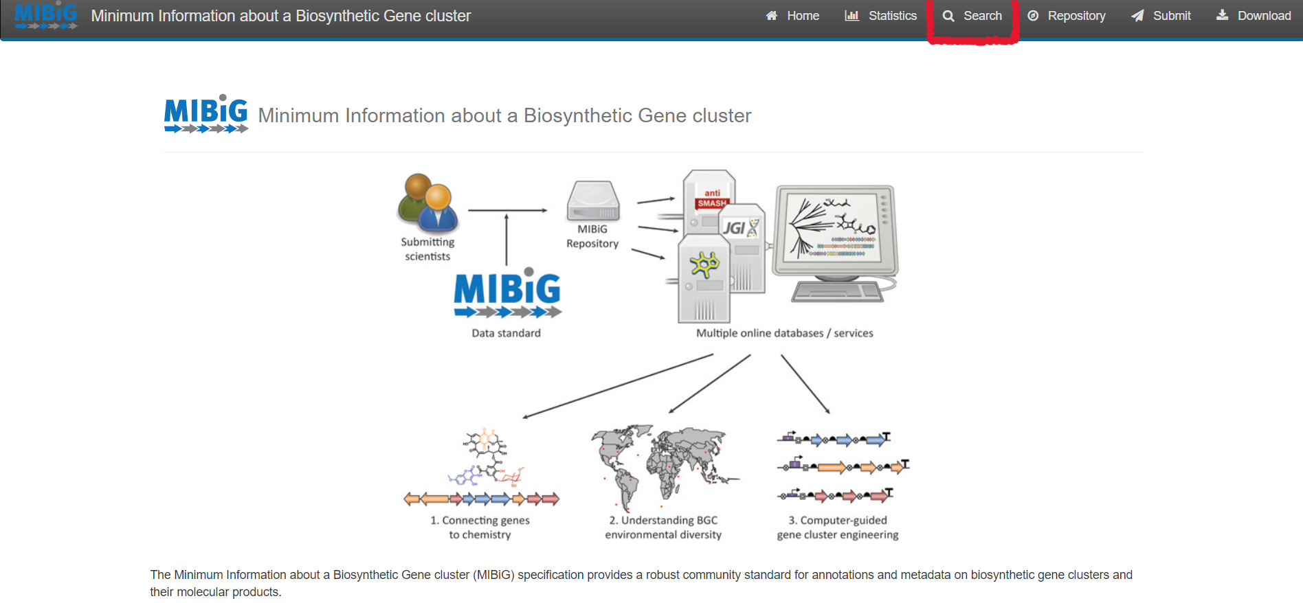
Figure 2
Image 1 of 1: ‘MIBiG website query page’
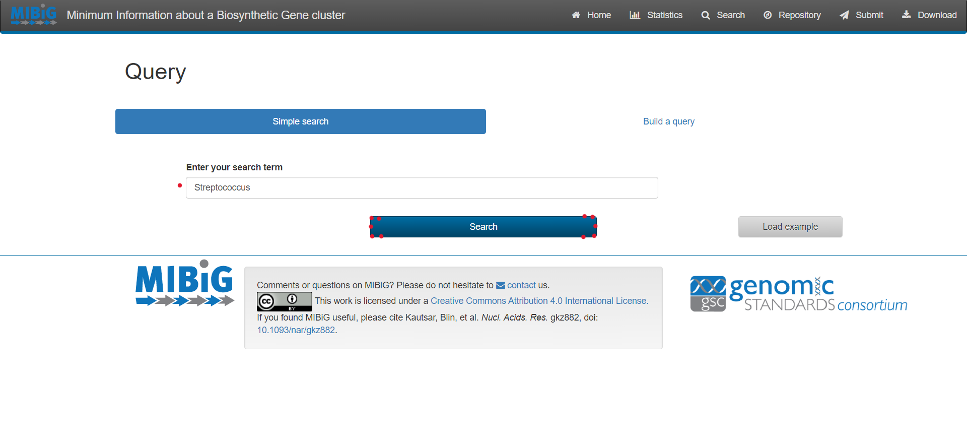
Figure 3
Image 1 of 1: ‘MIBiG website displaying the results from the simple search Streptococcus’
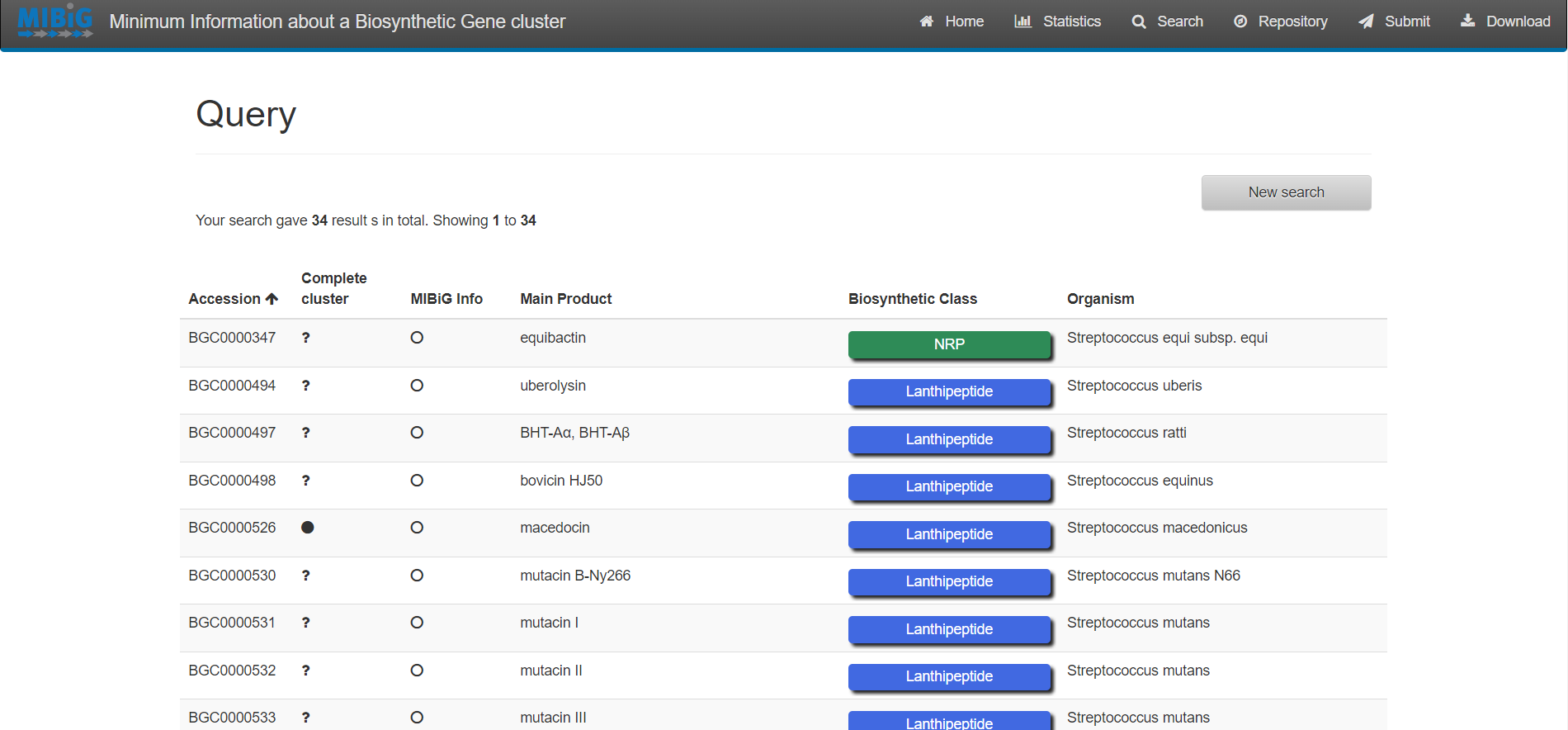
Figure 4
Image 1 of 1: ‘antiSMASH website homepage’
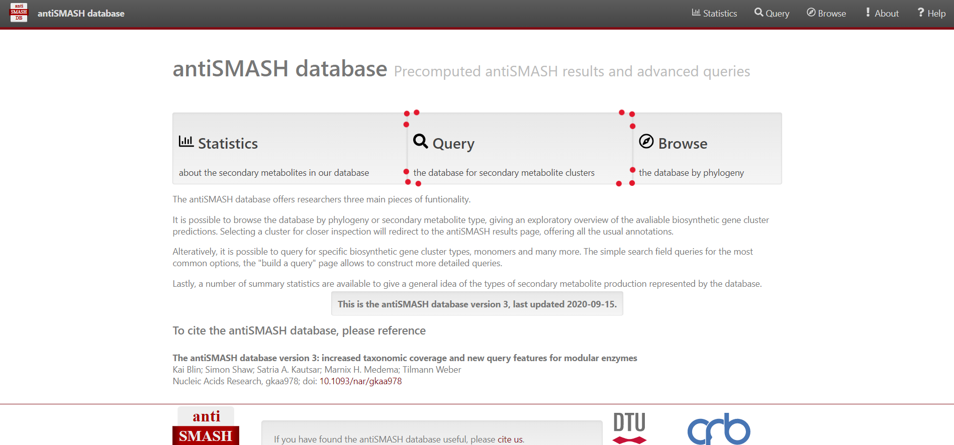
Figure 5
Image 1 of 1: ‘antiSMASH website query page’
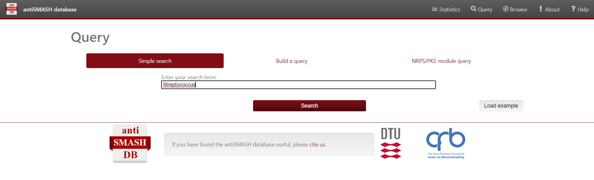
Figure 6
Image 1 of 1: ‘antiSMASH website displaying the results from the simple search Streptococcus’
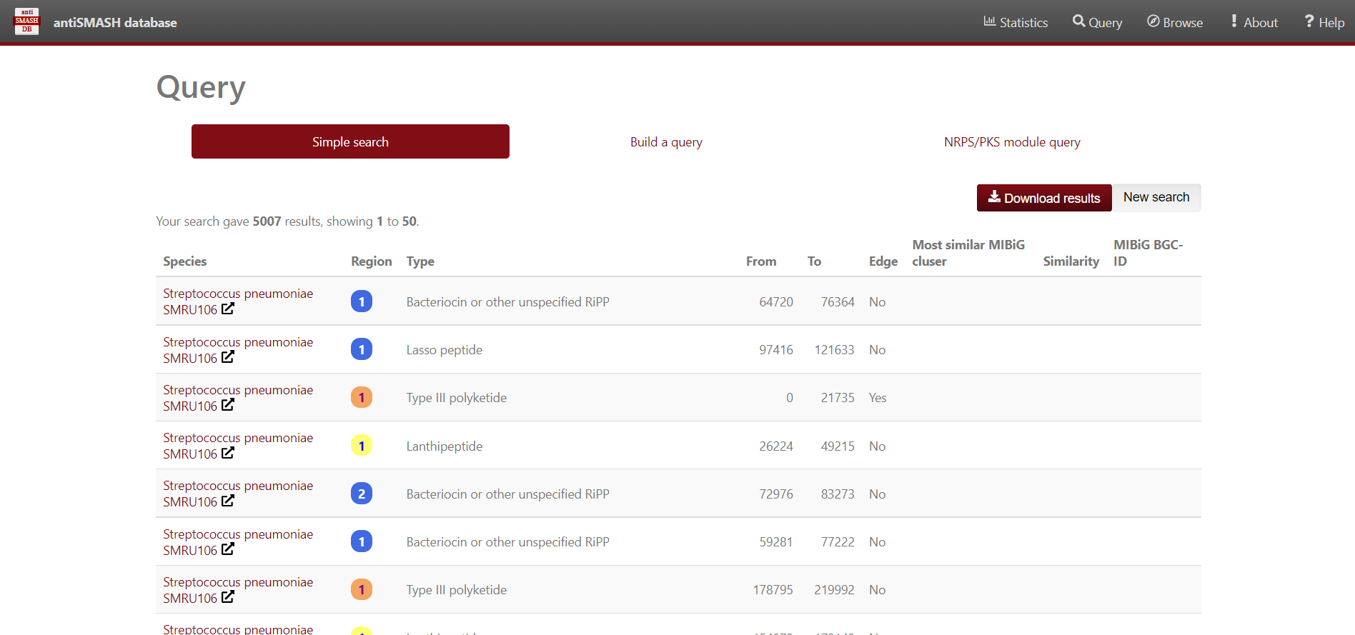
Figure 7
Image 1 of 1: ‘a dataframe variable the content of the Streptococcus predicted BGC’
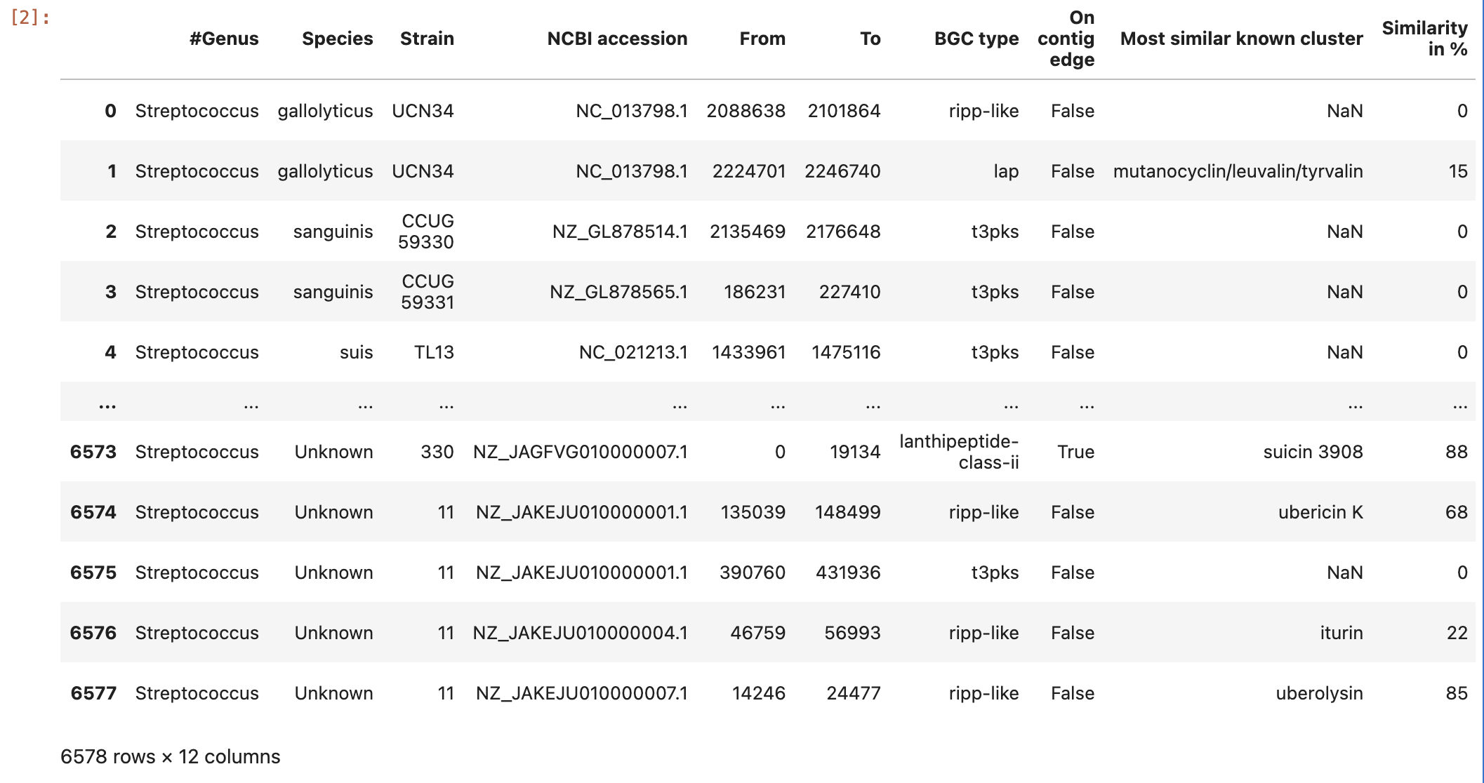
Figure 8
Image 1 of 1: ‘the content of the ocurrences grouped by species column’
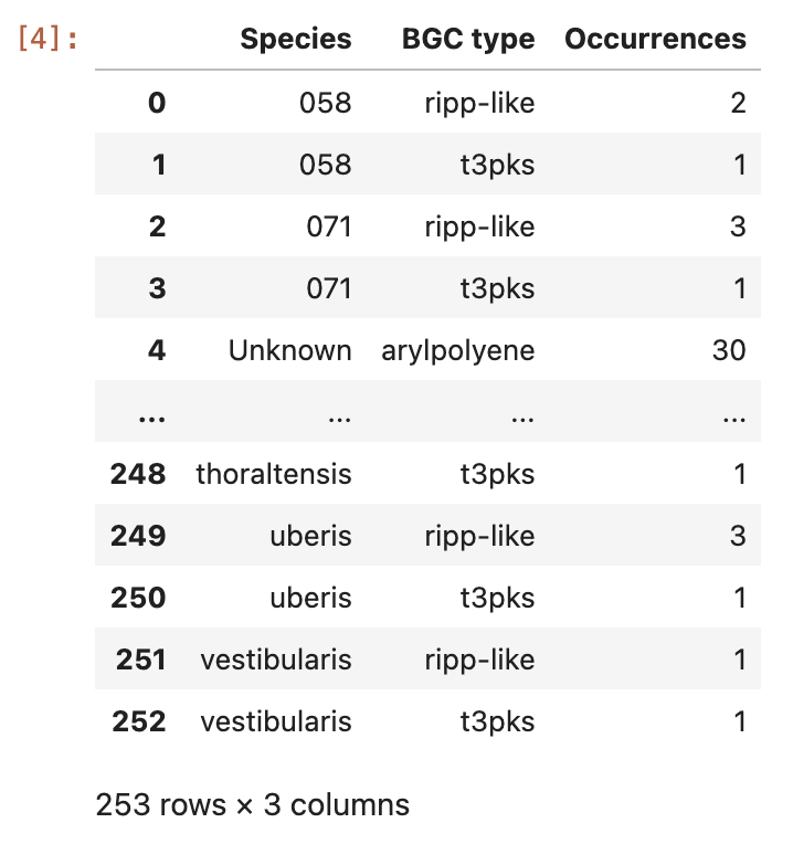
Figure 9
Image 1 of 1: ‘visualization of the BGC content on a heatmap.’
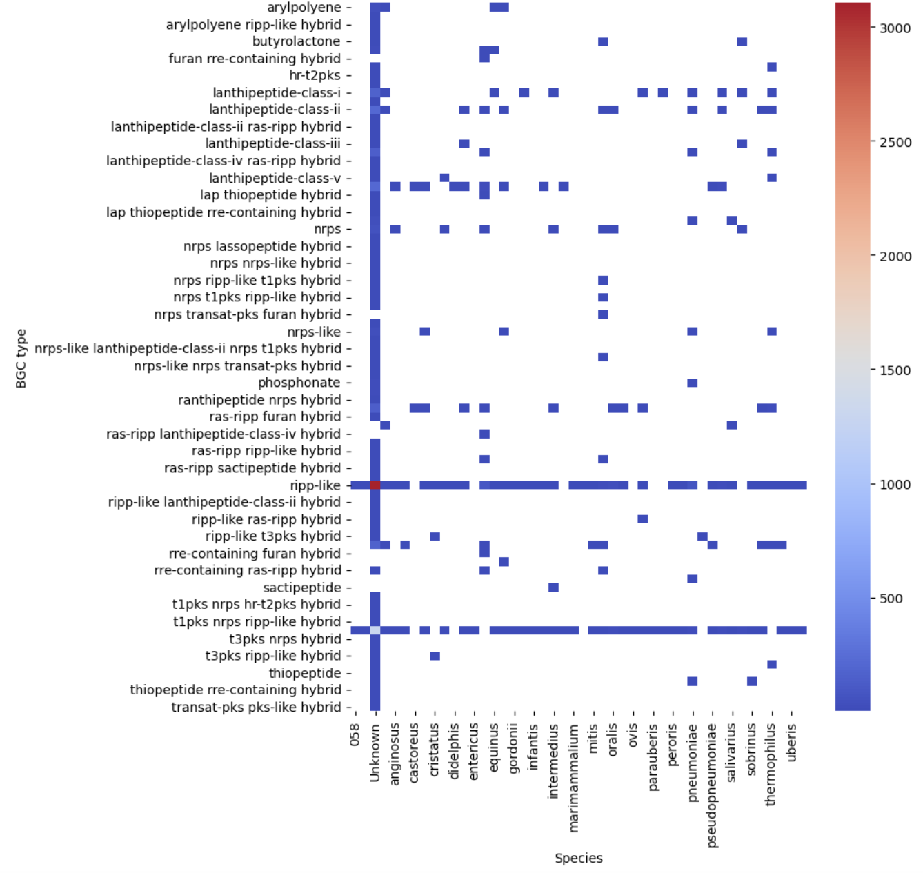
Figure 10
Image 1 of 1: ‘visualization of the BGC content of S. agalactiae. on a sctterplot’
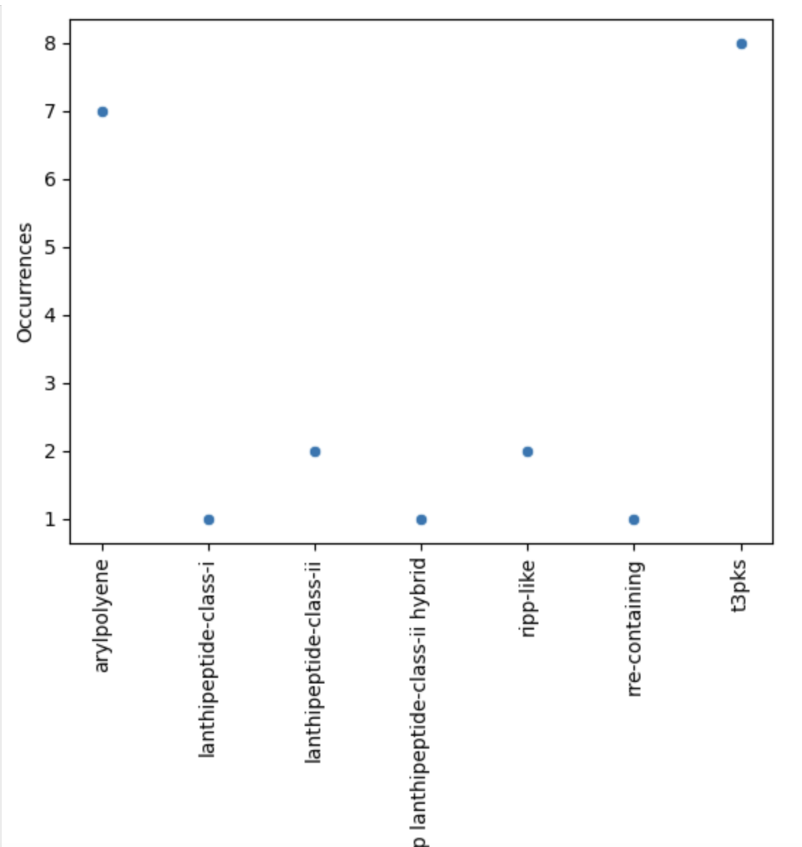
Figure 11
Image 1 of 1: ‘visualization of the BGC content on a scatterplot’
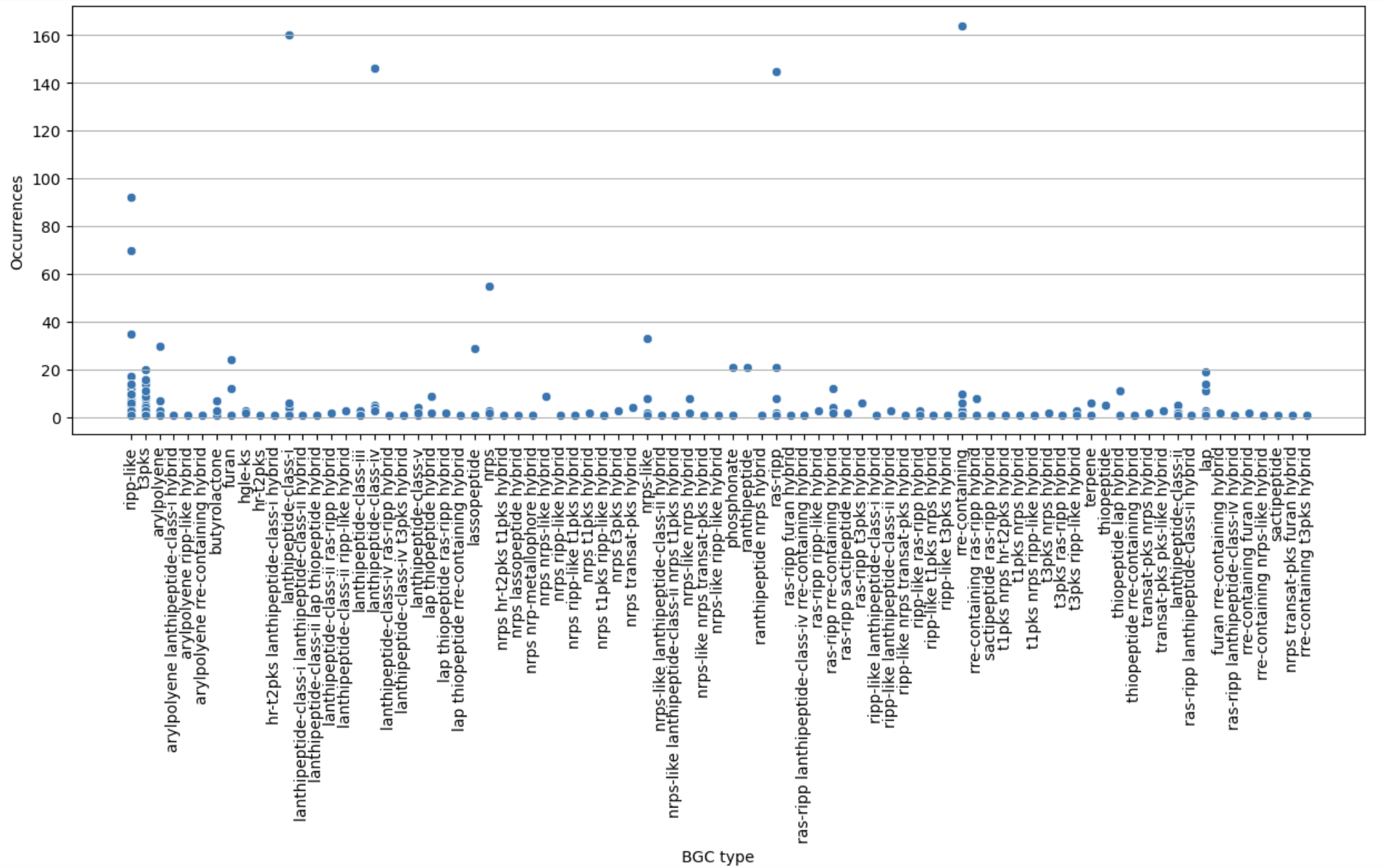
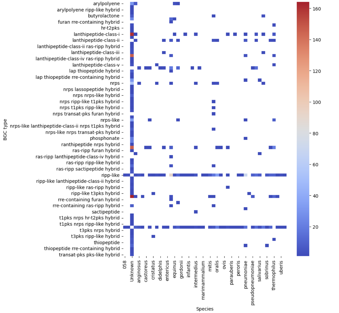
Figure 12
Image 1 of 1: ‘filtered heatmap ’
BGC Similarity Networks
Figure 1
Image 1 of 1: ‘BIG-SCAPE output as visualized in the web page. The overview page is displayed. At the left is the Run Information, indicating the date and time at which the analysis was started and completed, as well as the parameters of the run. Next is displayed the Input Data, specifying the total number of genomes and the total BGCs, in this example 8 and 23, respectively. There are two pie charts, one representing the BGC per Genome and the other the BGC per Class. At the right is the Network Overview, which allows selection between mix and the different BGC classes. From the mix overview it displays the Number of Families, Average number of BGCs per family, Max number of BGCs in a family and the Families with MIBiG Reference BGCs.’
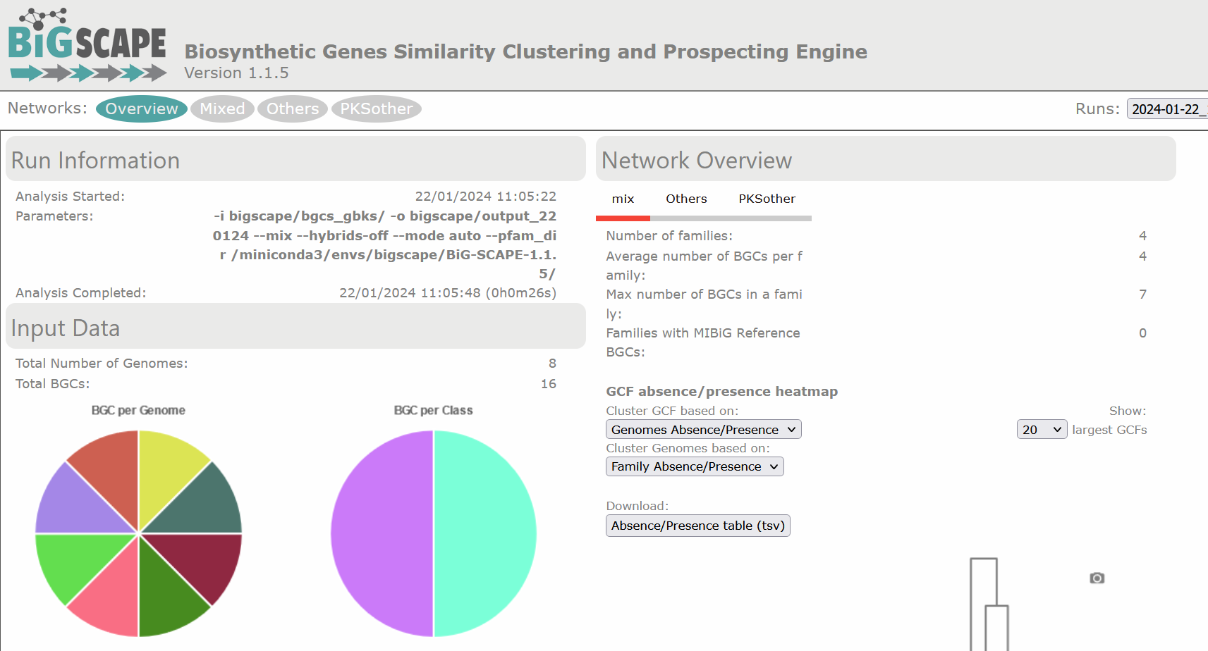
Figure 2
Image 1 of 1: ‘BIG-SCAPE output as visualized in the web page. The overview page displaying the clustered heatmap of the presence/absence of the GCFs, each class organized as a column at the base of the table, in each genome, which are organized as rows at the right side of the table. Presence is depicted in red with 1 and absence in beige with 0.’
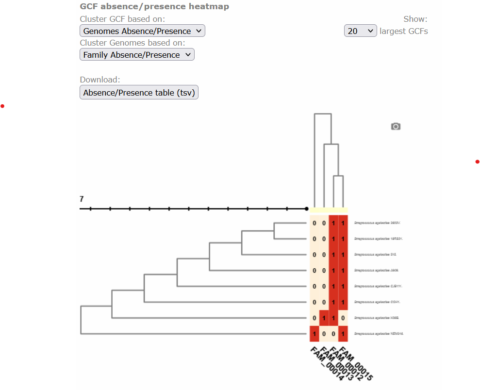
Figure 3
Image 1 of 1: ‘BIG-SCAPE similarity network of the complete mix of BGCs obtained from the run. A network is represented for each GCF, each dot represents a BGC. In this example there are a total of 23 BGCs, of which 6 are singletons, there are 28 links and 11 families. Clicking over any of the dots shows the GCF at the right side and allows you to explore it further.’
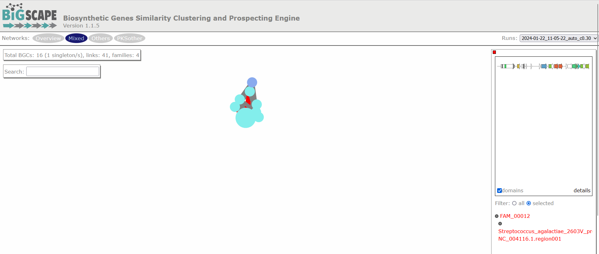
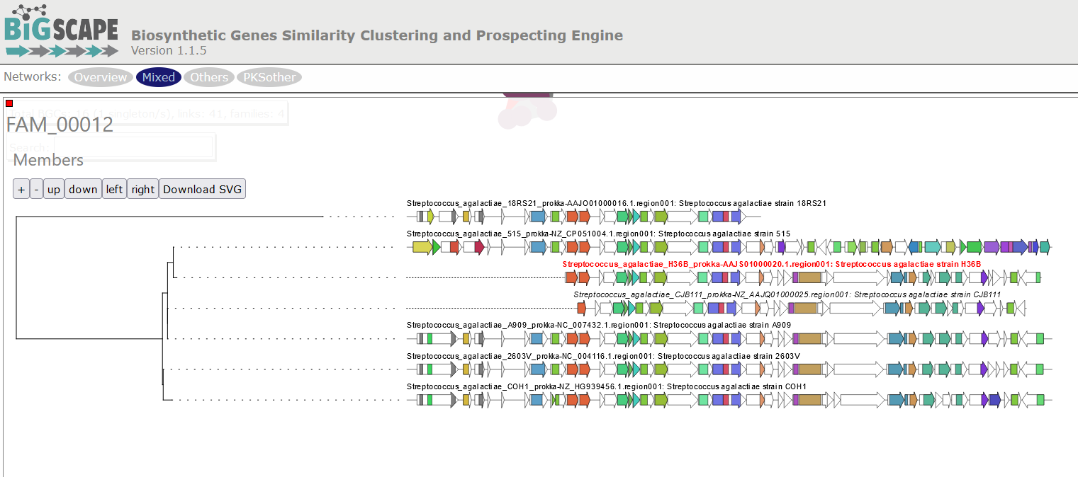
Figure 4
Image 1 of 1: ‘BIG-SCAPE output displaying a tree of phylogenetic distances among the BGCs comprised in a GCF. The example shows the GCF 10, comprised by six members. Each BGC is represented in the tree by an arrow diagram of the genes and the protein domains in the genes corresponding to that cluster.’
Homologous BGC Clusterization
Figure 1
Image 1 of 1: ‘Three biomolecules are depicted in three different colors; blue, red and purple. These molecules are present in BGCs of diverse bacterial lineages and in turn grouped into Gene Cluster Families (GCFs). GF1 contains three domains related to the blue molecule and three from the red molecule. GF2 contains four domains of each of the molecules, blue, red and purple. GCF3 and GCF4 contain each three domains associated with the purple biomolecule but different from each other. Every GCF produces a different metabolite, here represented as weapons or tools.’
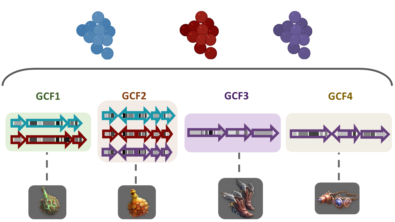
Figure 2
Image 1 of 1: ‘Example of tsv table composed by five columns and two rows. The first row contains the title for each column; # Dataset name, Path to folder, Path to taxonomy, Description.’

Figure 3
Image 1 of 1: ‘Example of the structure of the input-folder. The content of the directory input-folder is displayed in a tree-like format, listing the files and directories inside it.’
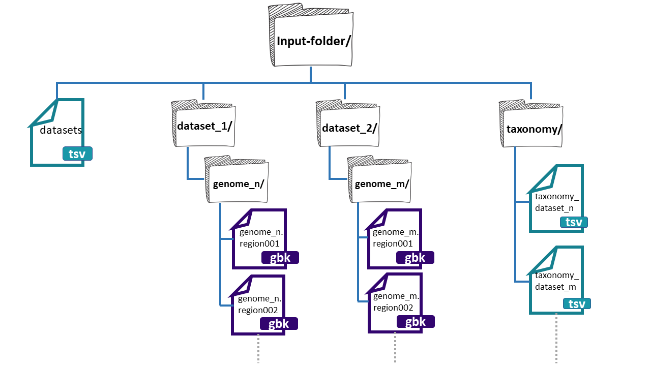
Figure 4
Image 1 of 1: ‘BiG SLiCE web page output displaying the results obtained from the example run. A left panel presents the information generated, composed of seven tabs; Summary, Datasets, Runs, Reports, Help, Feedback, and About. The rest is a Summary of all datasets and runs included in the output. Appearing firstly, the Datasets provided as input, organized as a table with five rows; name, #genomes, total, with taxonomy, and description. Next, the information about the Runs, also organized as a table with the following rows; name, started, finished, status, threshold, #BGCs, and #GCFs..’
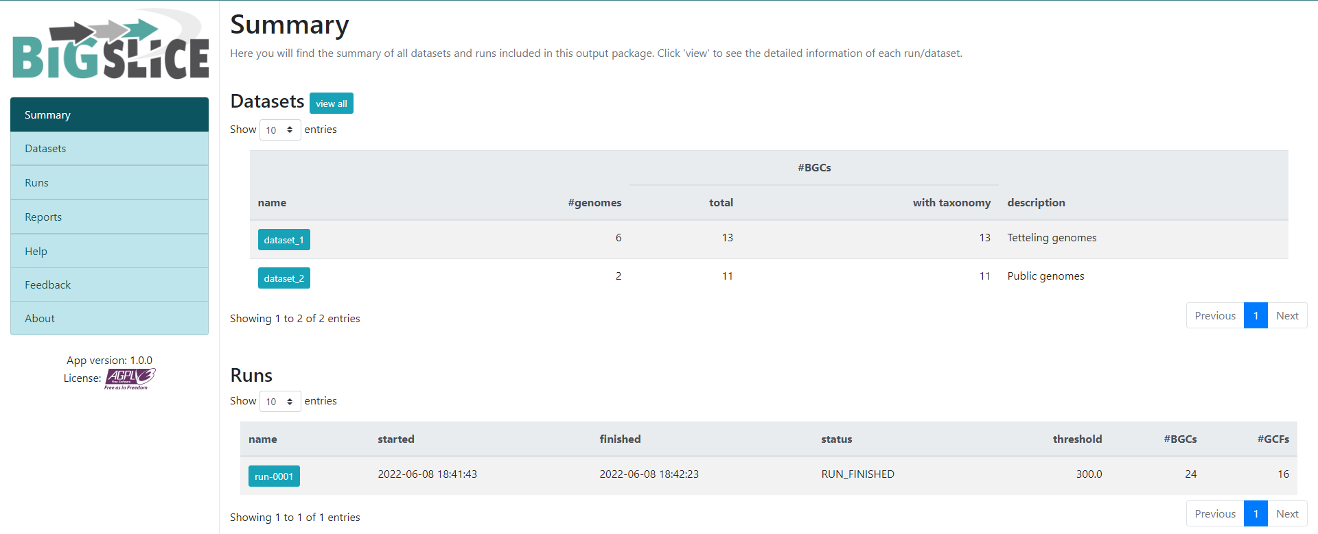
Figure 5
Image 1 of 1: ‘BiG SLiCE web page output displaying the information obtained from the Run-0001. Firstly, it is shown an Overview from the Run. Indicating the Status, when was it Started and Finished, as well as the Parameters, the HMM models and the Input. Next, the Statistics about the run are shown as two bar-plots. The left one plots the average distance to GCF models, whilst the right one shows the amount of BGCs in GCFs.’
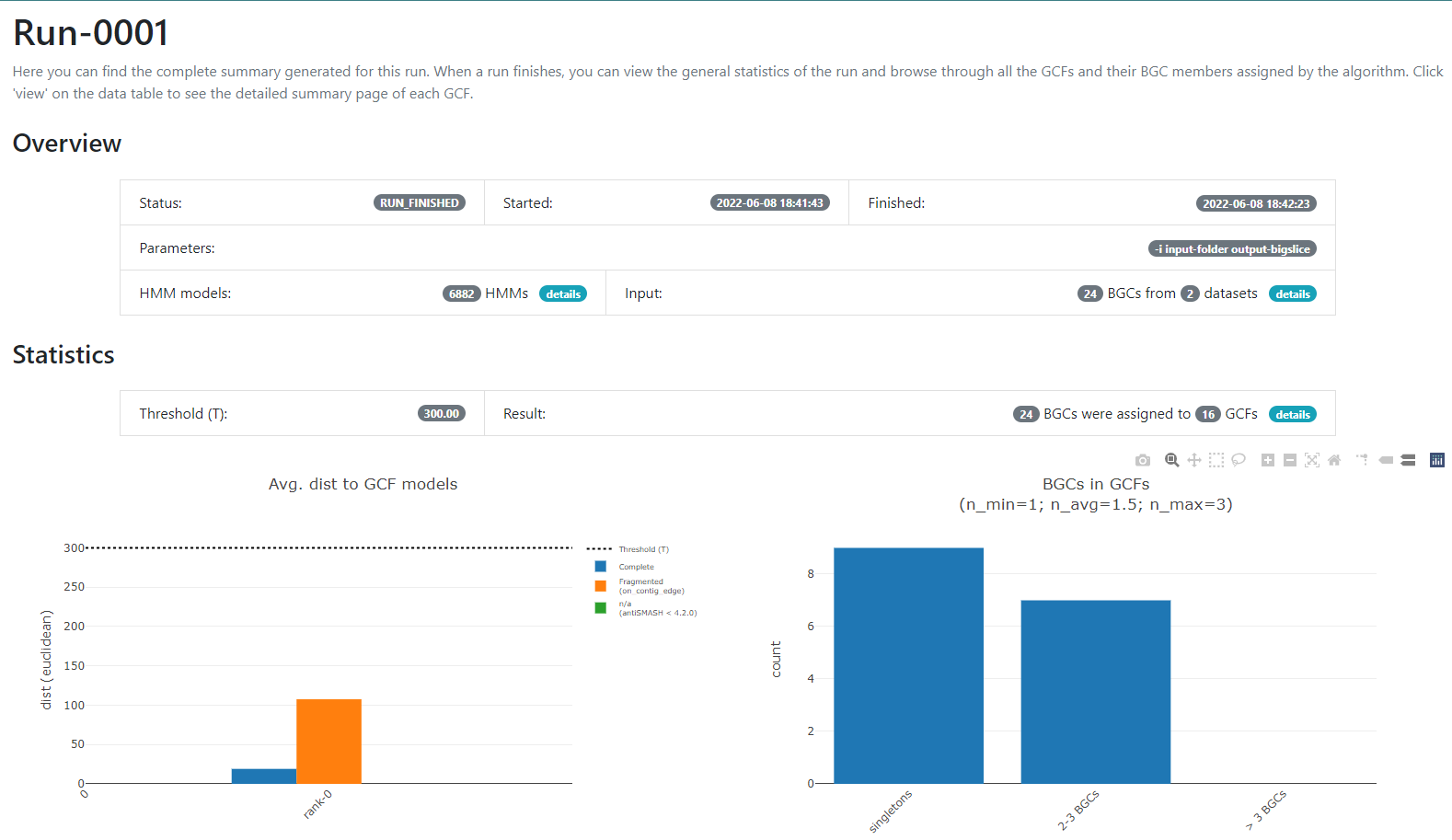
Figure 6
Image 1 of 1: ‘BiG SLiCE web page output displaying detailed information regarding the BGCs from GCF_7. The Arrowers show a gene arrow visualization of the domains that are part of each of the genes of the BGCs belonging to GCF_7.’
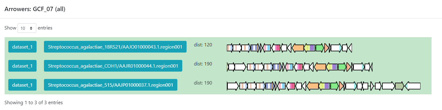
Figure 7
Image 1 of 1: ‘BiG-FAM main page showing an introduction as well as a graphical representation of the database. A left panel displays the available options; Home, GCFs, BGCs, Query, Statistics, Help, Feedback, and About. ’
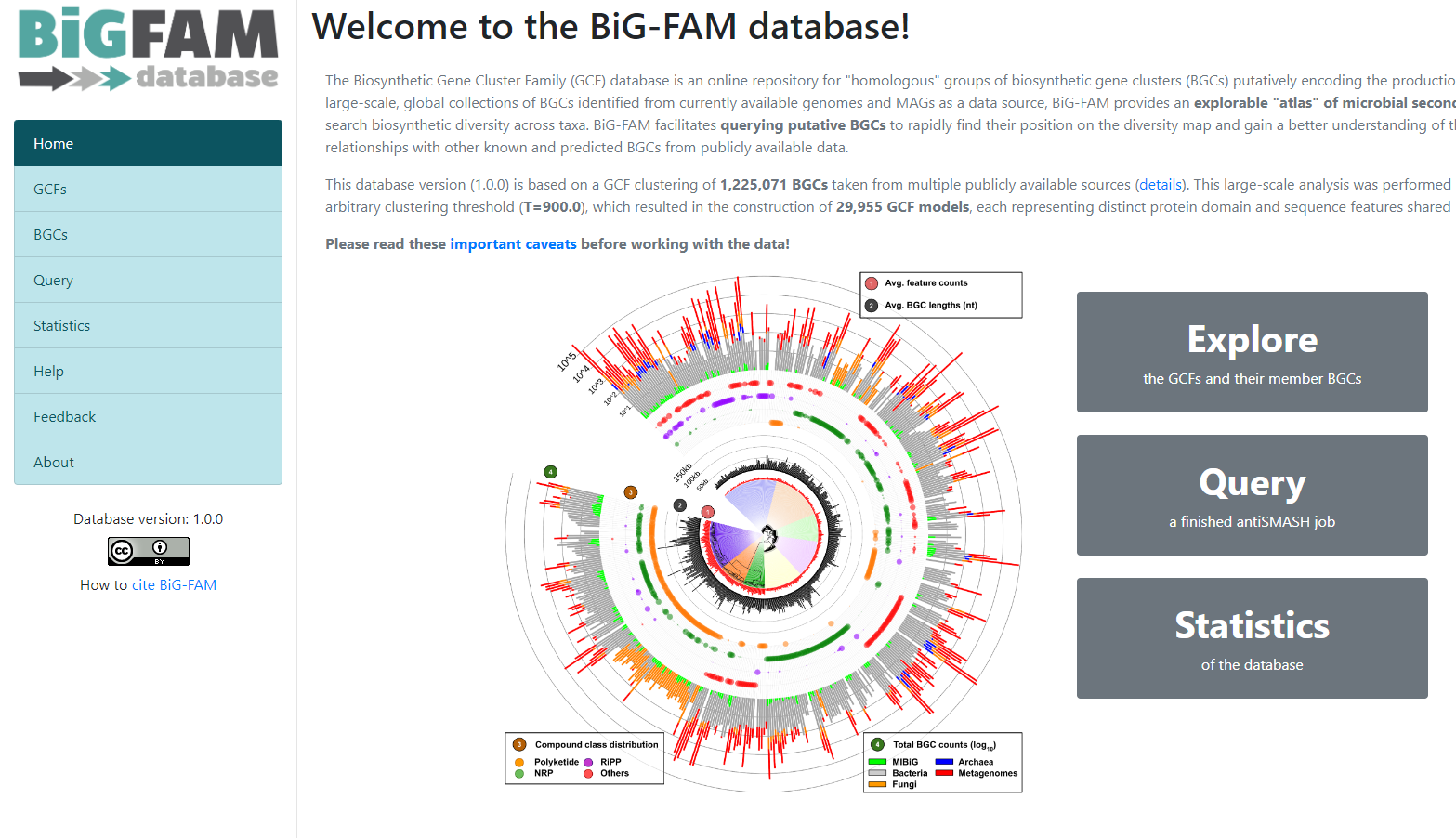
Figure 8
Image 1 of 1: ‘BiG-FAM query page with the option for inserting an antiSMASH job and submitting it. Below it is described how much of the job is Pending, Processing, and Processed.’
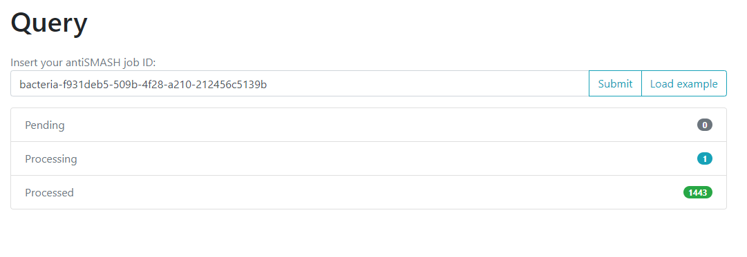
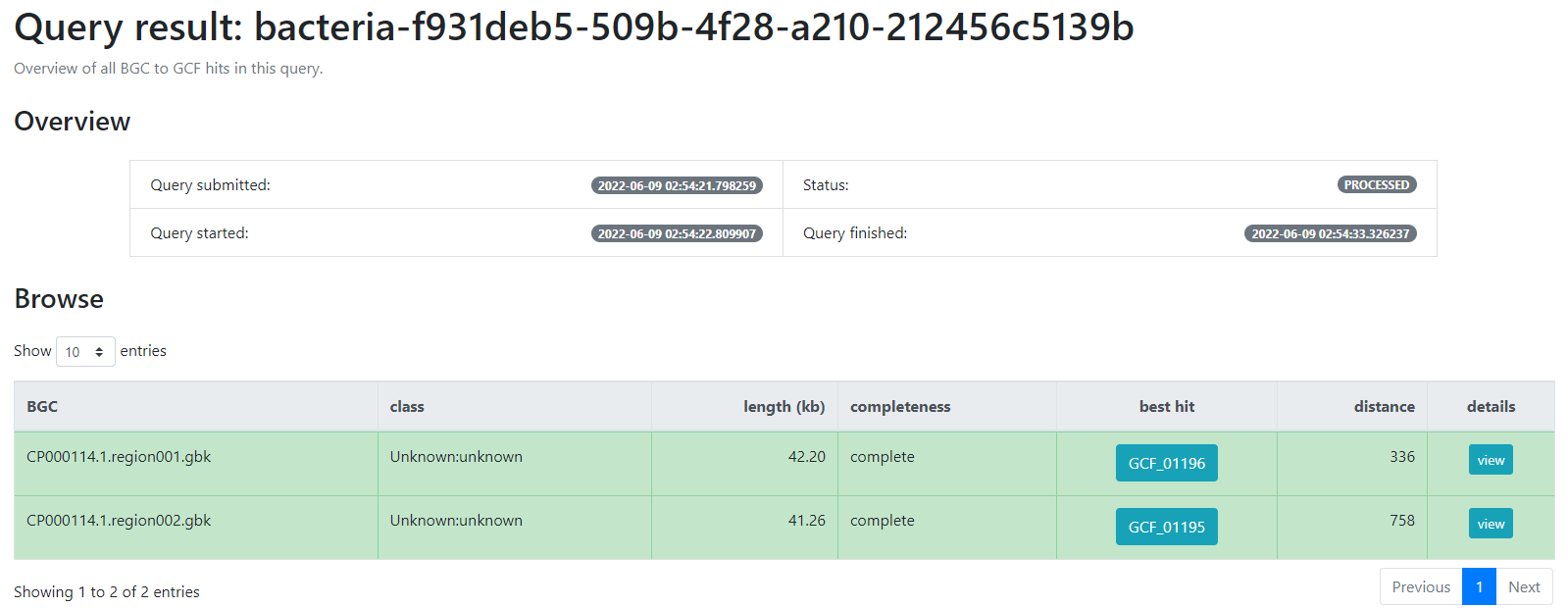
Figure 9
Image 1 of 1: ‘BiG-FAM result page indicating firstly an overview of the job; the query which was submitted, its status, as well as the time at which it was started and finished. Next, a table indicating the BGCs from the database which are related with the query BGCs. This is organized as a table with seven rows; query BGC, class, length (kb), completeness, best hit, distance and details’
Finding Variation on Genomic Vicinities
Figure 1
Image 1 of 1: ‘CORASON's workflow for sorting phylogenetically BGCs. Given a query gene in a reference BGC and a genomic annotated database, CORASON firstly searches for query gene homologues, it filters out all genomic vicinities not related to the reference BGC. Then, CORASON infers a phylogenetic tree and calculates the frequency of occurrence for each gene family from the reference BGC. Using the same reference BGC, if a new query gene is selected, CORASON visualizes a new phylogeny with families containing the same molecular modifications.’
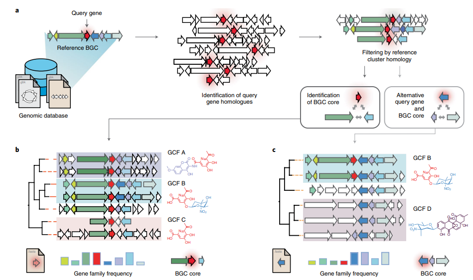
Figure 2
Image 1 of 1: ‘CORASON phylogenetic svg reconstruction using cpsG as query gene and _S. agalactiae_ 1000006 as query cluster. At the bottom, it is displayed the frequency of occurrence for each gene family from the reference BGC, each with a different color.’
Figure 3
Image 1 of 1: ‘CORASON phylogenetic svg reconstruction using cpsG as query gene and _S. agalactiae_ 1000006 as query cluster. At the bottom, it is displayed the frequency of occurrence for each gene family from the reference BGC, each with a different color.’

Evolutionary Genome Mining
Figure 1
Image 1 of 1: ‘a) EvoMining expansion-and-recruitment pipeline. A group of grey stacked cylinders representing genomes in a database (DB). Homologues and expansions of seed enzymes, represented as an orange arrow, from the enzyme DB are searched by blastp in the genome DB. The outcome is integrated as the expanded enzyme families (EFs) within the genome DB. Bidirectional best hits (BBH) of seed enzymes, red arrows, are marked as conserved metabolism. The EFs are amplified after being compared against a DB of natural products (NP) biosynthetic enzymes, represented by a blue cylinder, to find recruitments defined as enzymes of the family that are part of a MIBiG BGC. b) The genome DB, represented by the gray stacked cylinders, is searched as previously described. Additionally, antiSMASH predictions, cyan arrows, can be added by the user. antiSMASH enzyme predictions that are at the same time marked in red are defined as transition enzymes, purple arrows. c) EvoMining phylogenetic reconstruction and visualization. On the left side, a phylogenetic reconstruction of an EF is shown. On the right side it is shown the EvoMining tree displaying the EvoMining predictions (green), which are those extra copies closer to enzyme recruitments into BGC (blue) than to conserved metabolic enzymes (red). antiSMASH predicted enzymes are represented in cyan, transition enzymes in black and extra copies that are neither antiSMASH nor EvoMining predictions are left in grey.’
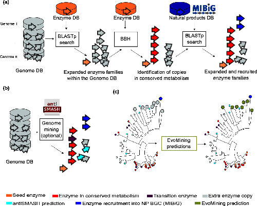
Figure 2
Image 1 of 1: ‘EvoMining phylogenetic reconstruction providing evolutionary insights into the metabolic origin and the fate of members of diverse EF from the Streptococcus example. Seed enzymes are labeled in orange. The most conserved copies or central metabolism copies are marked in red. Enzyme copies recruited into specialized metabolism, contained in MIBiG, are labeled in blue. Enzyme copies that are closer to blue enzyme recruitments than to red conserved enzymes are labeled in green and represent EvoMining Hits. Extra copies with an unknown metabolic fate are shown in gray.’

Figure 3
Image 1 of 1: ‘Select the path to download file’

Figure 4
Image 1 of 1: ‘Select the path to download file’
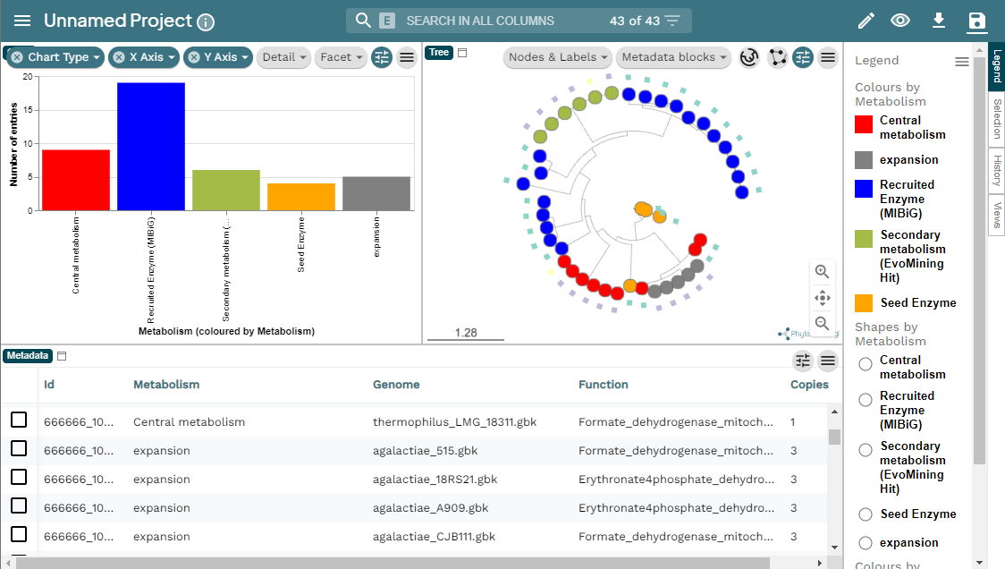
Figure 5
Image 1 of 1: ‘MicroReact visualization of the EvoMining run Streptococcus example. At the left a bar-chart with the EF in the X axis and the number of entries in the Y axis. At the right, the EvoMining phylogenetic tree using the same color code as the chart. Right of the tree the legend indicating the colors by metabolism; central metabolism enzymes in red, expansion enzymes in gray, recruited enzymes contained in MIBiG in blue, secondary metabolism enzymes (EvoMining hits) are marked in green, and seed enzymes are colored in orange. Below appears the metadata from the run, organized in a five row table including Id, metabolism, genome, function and copies.’
GATOR-GC: Genomic Assessment Tool for Orthologous Regions and Gene Clusters
Figure 1
Image 1 of 1: ‘GATOR methods’
Figure 2
Image 1 of 1: ‘GATOR methods’

Figure 3
Image 1 of 1: ‘Heatmap resulting from cpsg gator-gc analysis’

Figure 4
Image 1 of 1: ‘Conservation plot for the first window’

Figure 5
Image 1 of 1: ‘Fisrt window_1_neighborhood plot for the first window’

Metabolomics workshop
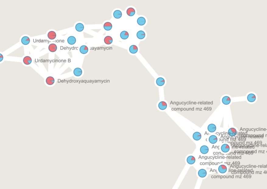
Figure 1
Image 1 of 1: ‘GNPS output can be directly visualized in the GNPS webpage, or using other visualization tools such as [Cytoscape](https://cytoscape.org/) ’
](fig/Molecular-network.png)
Figure 2
Image 1 of 1: ‘Create an account in GNPS’
Figure 3
Image 1 of 1: ‘MZmine 3, an MS data analysis platform ’
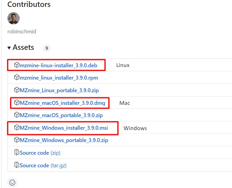
Figure 4
Image 1 of 1: ‘Data collection from *Streptomyces* sp. H-KF8, and *Streptomyces* sp. Vc74B-19.’
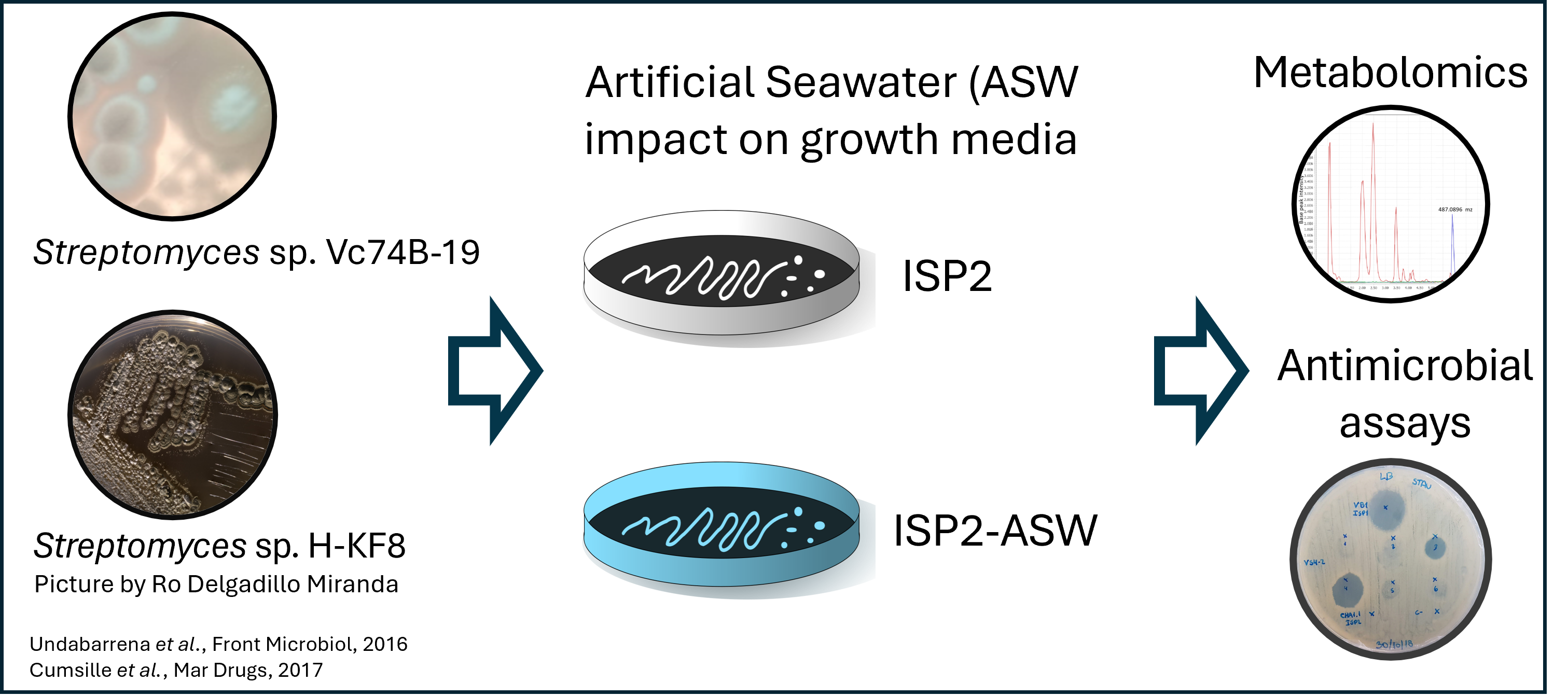
Figure 5
Image 1 of 1: ‘Data collection from *Streptomyces* sp. H-KF8, and *Streptomyces* sp. Vc74B-19.’
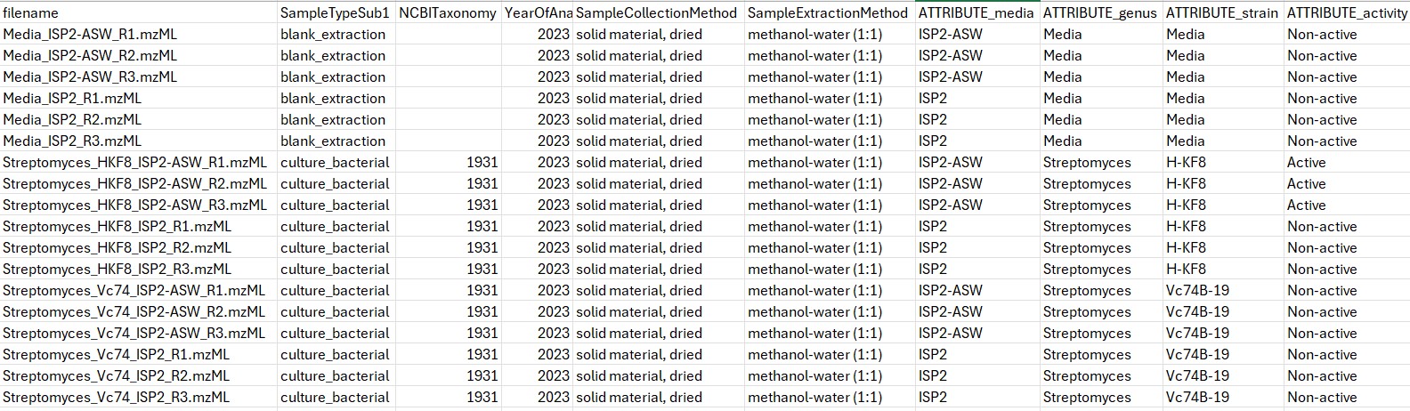
Figure 6
Image 1 of 1: ‘Load batch file’
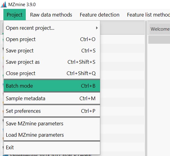
Figure 7
Image 1 of 1: ‘Load batch file’
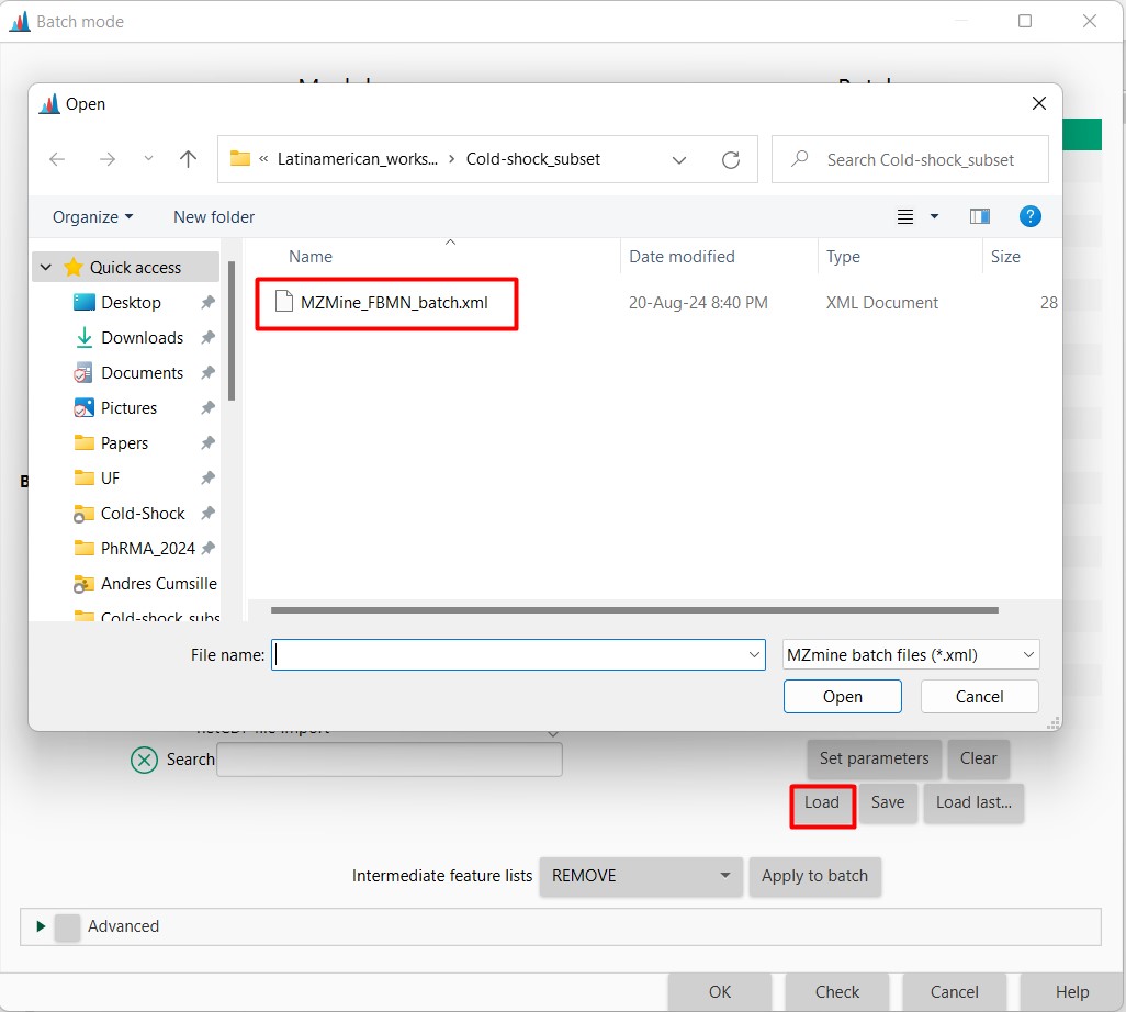
Figure 8
Image 1 of 1: ‘Load batch file’
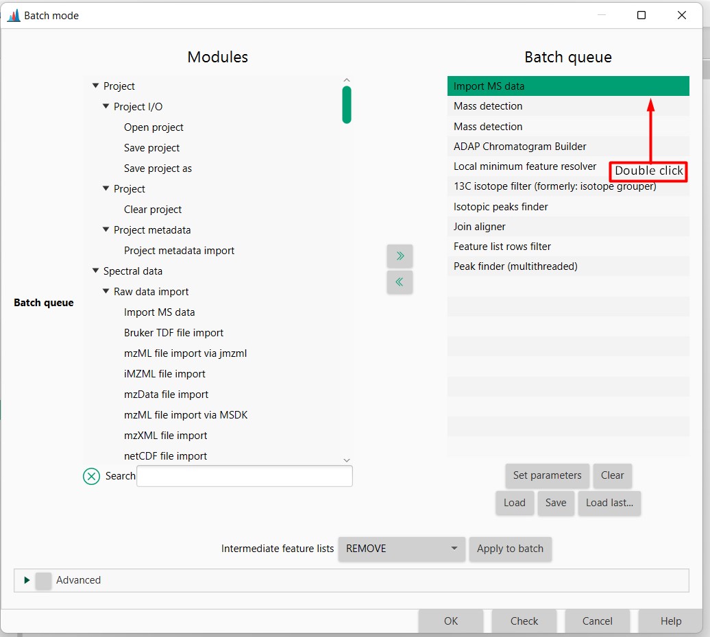
Figure 9
Image 1 of 1: ‘Load batch file’
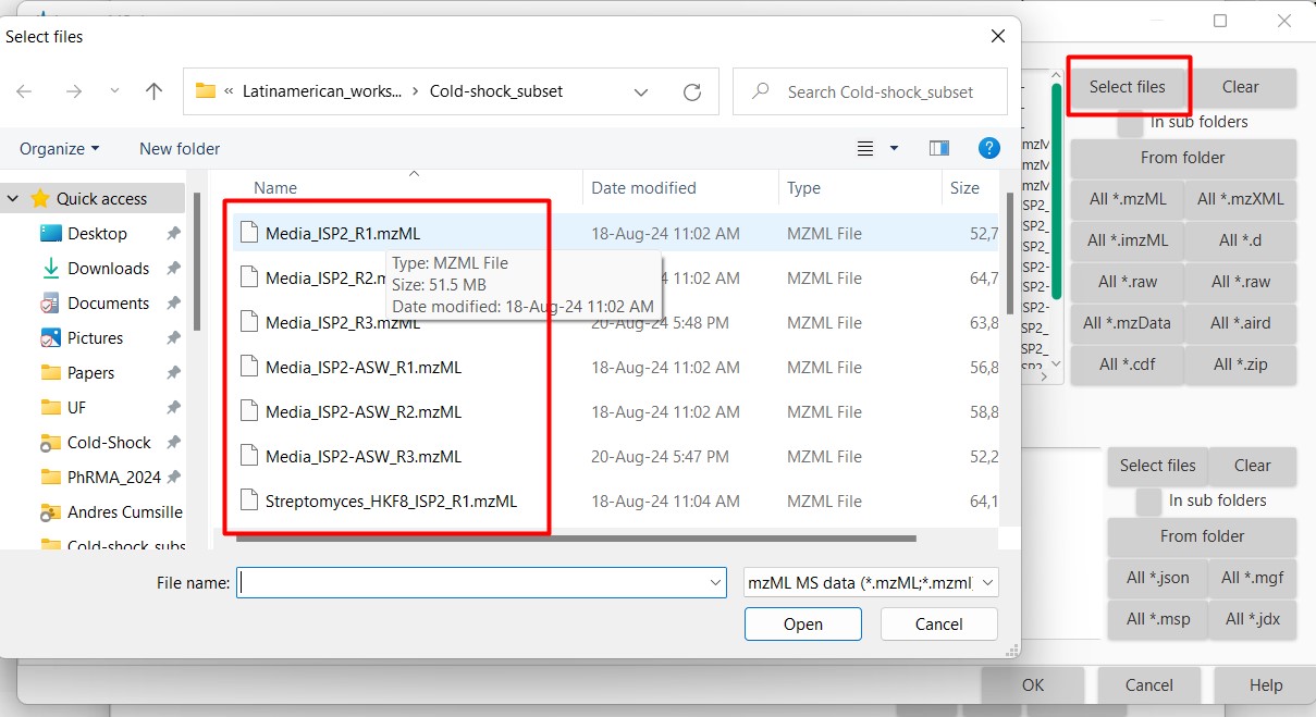
Figure 10
Image 1 of 1: ‘Load batch file’
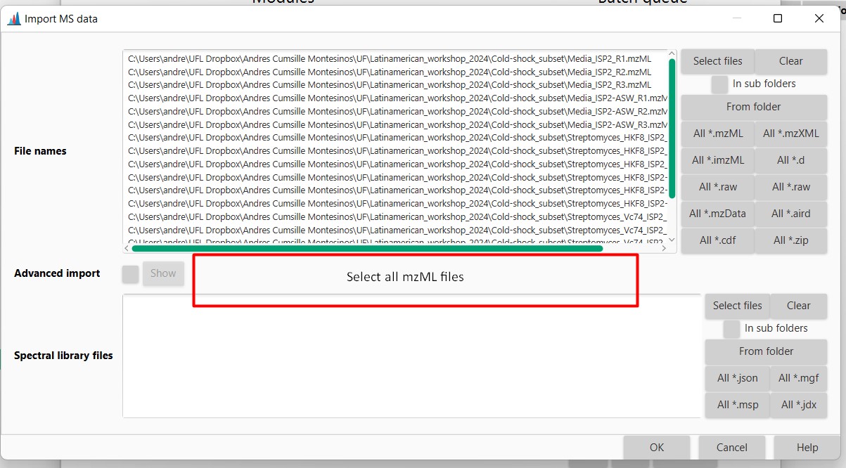
Figure 11
Image 1 of 1: ‘Datasets’
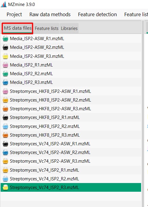
Figure 12
Image 1 of 1: ‘Chromatogram’
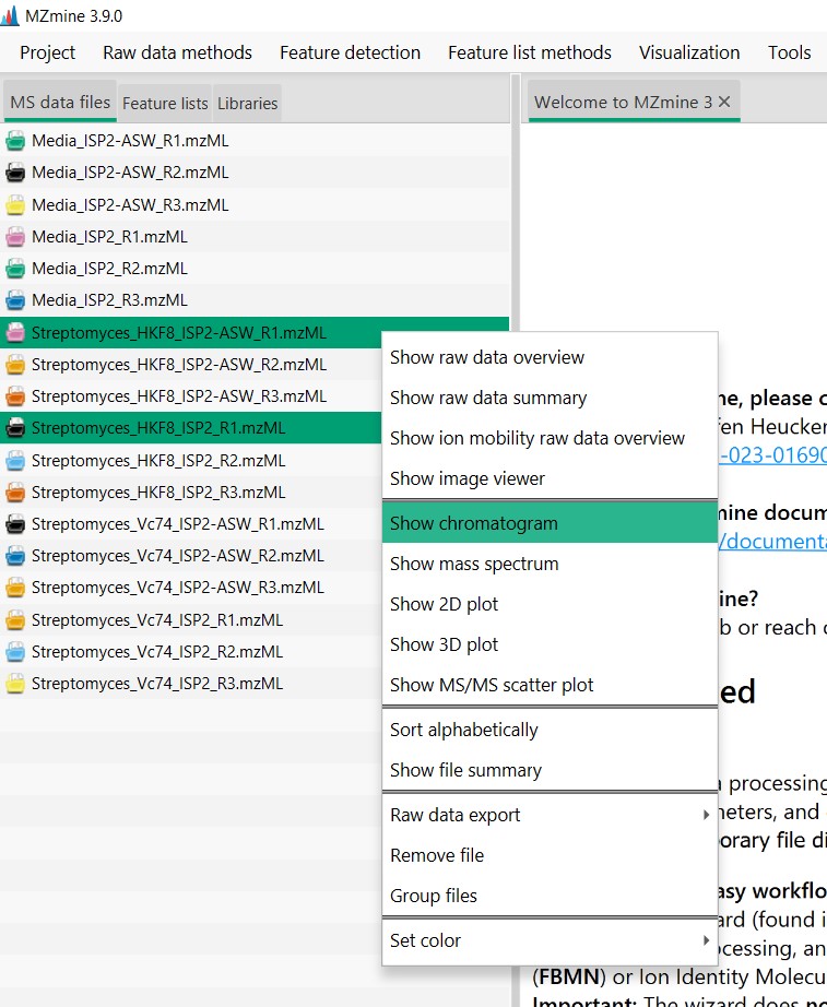
Figure 13
Image 1 of 1: ‘Chromatogram’
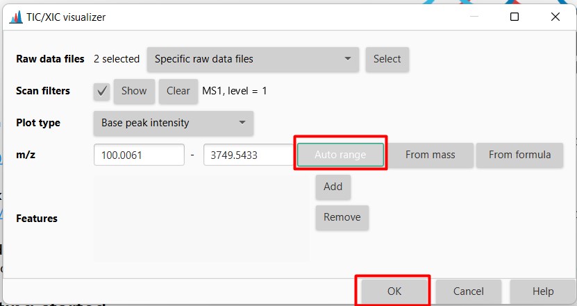
Figure 14
Image 1 of 1: ‘Chromatogram’
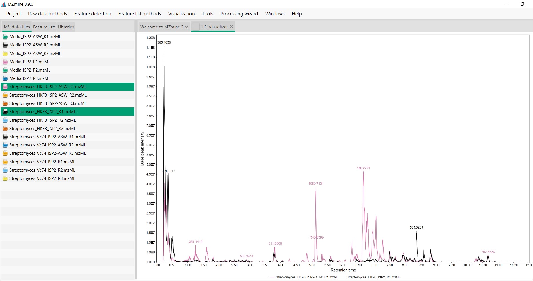
Figure 15
Image 1 of 1: ‘Chromatogram’
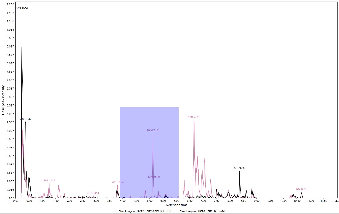
Figure 16
Image 1 of 1: ‘Chromatogram’
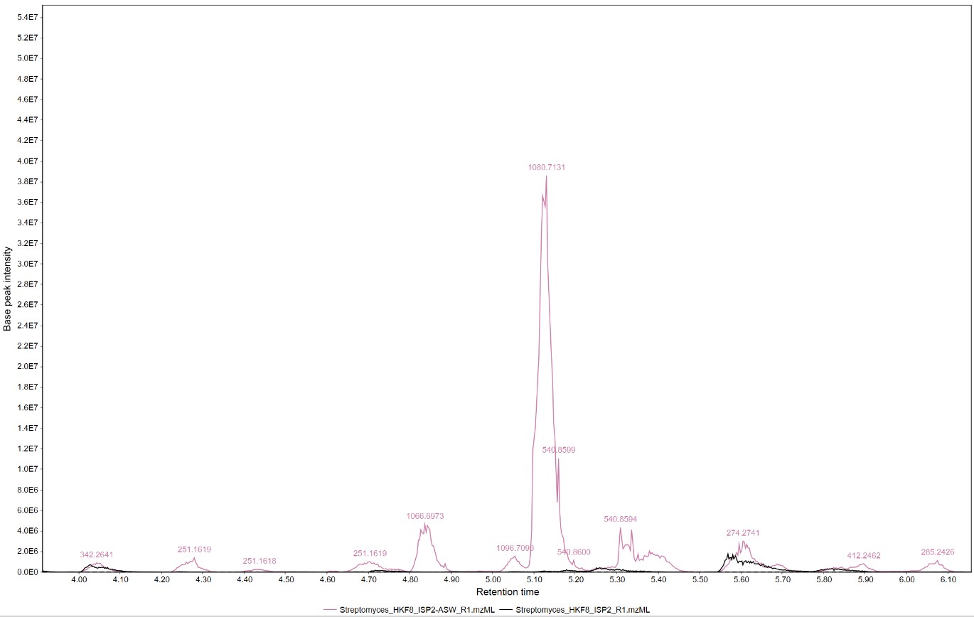
Figure 17
Image 1 of 1: ‘Feature list’
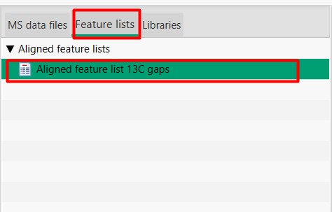
Figure 18
Image 1 of 1: ‘Feature List’
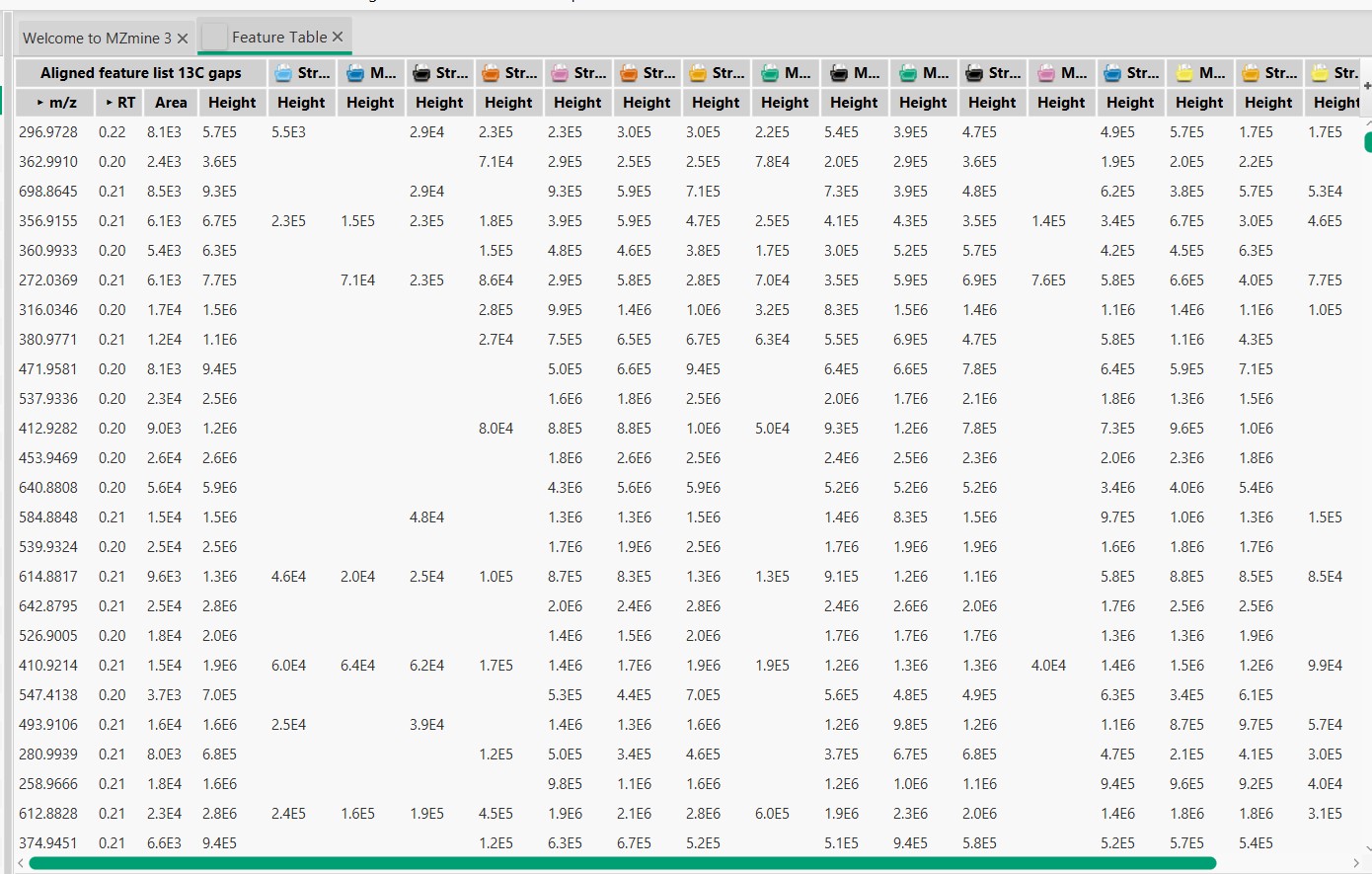
Figure 19
Image 1 of 1: ‘Blank substraction’
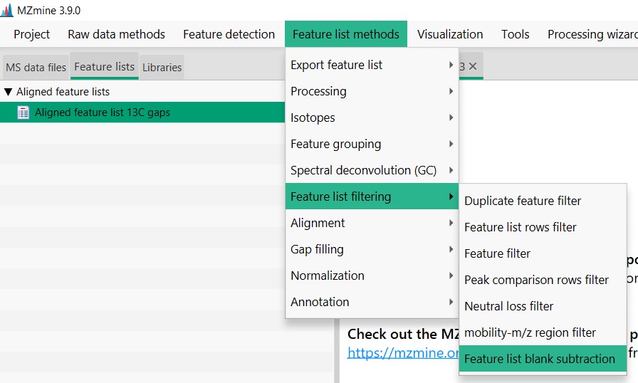
Figure 20
Image 1 of 1: ‘Blank substraction’
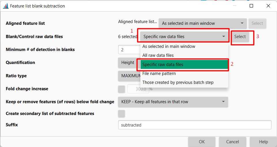
Figure 21
Image 1 of 1: ‘Blank substraction’
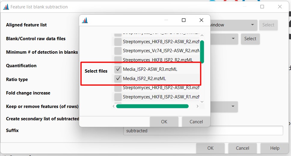
Figure 22
Image 1 of 1: ‘Blank substraction’
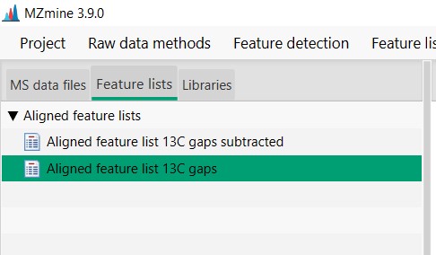
Figure 23
Image 1 of 1: ‘Export files’
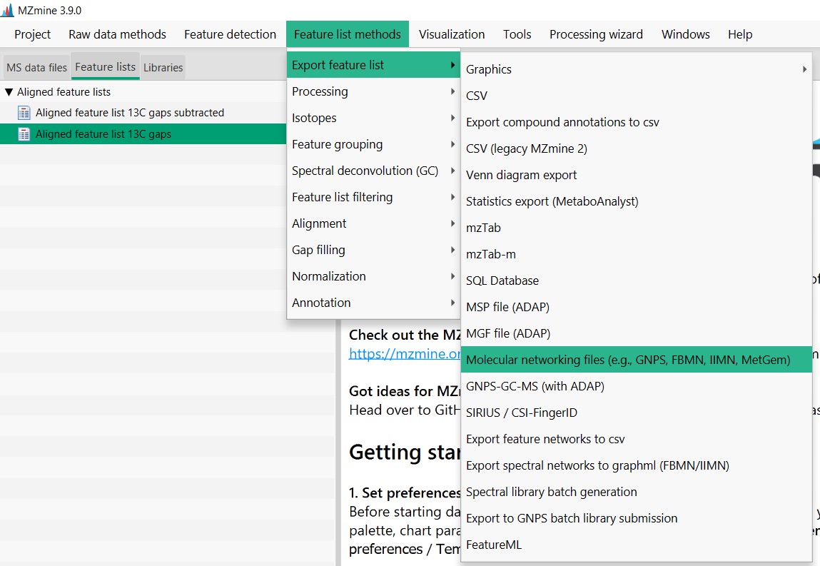
Figure 24
Image 1 of 1: ‘Export files’
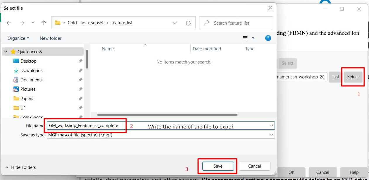
Figure 25
Image 1 of 1: ‘Export files’
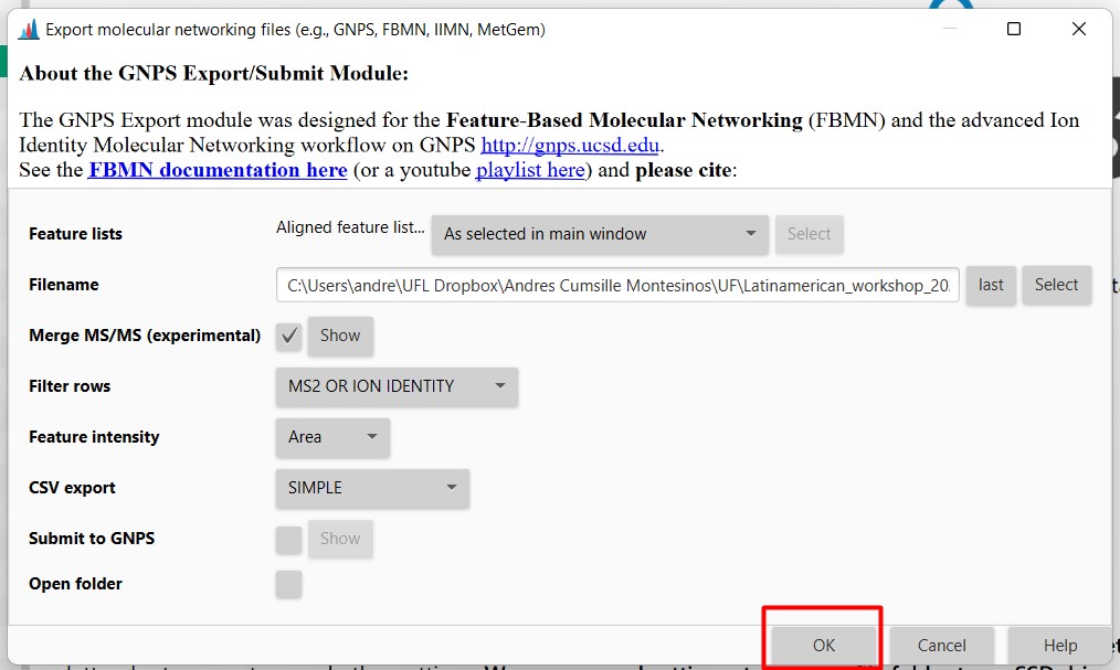
Figure 26
Image 1 of 1: ‘Export files’
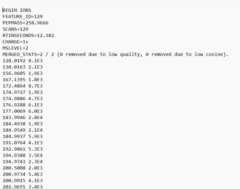
Figure 27
Image 1 of 1: ‘FBMN’
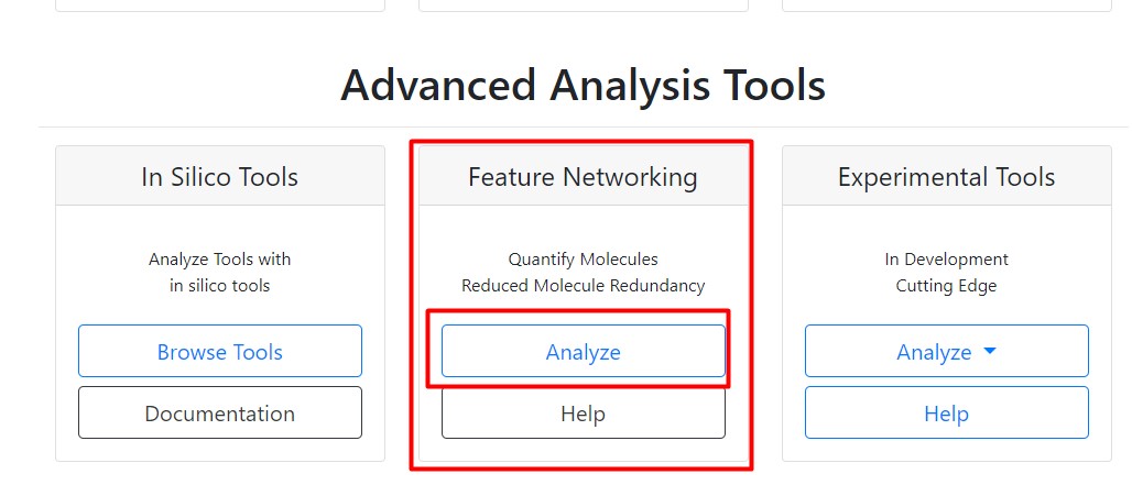
Figure 28
Image 1 of 1: ‘FBMN’
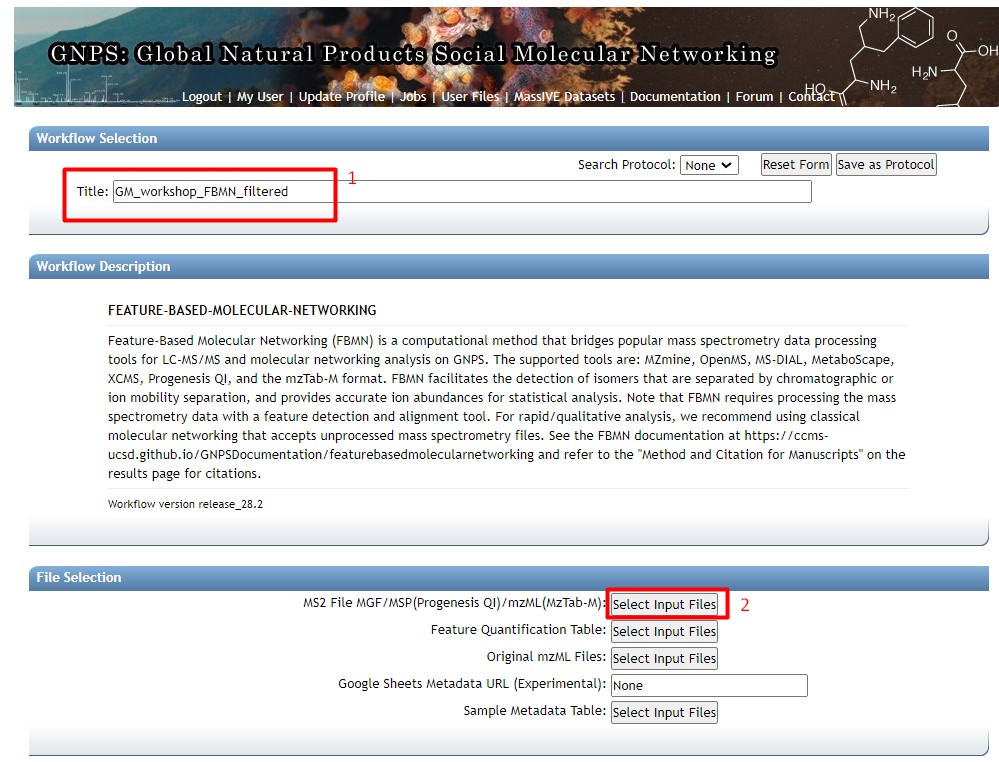
Figure 29
Image 1 of 1: ‘FBMN’
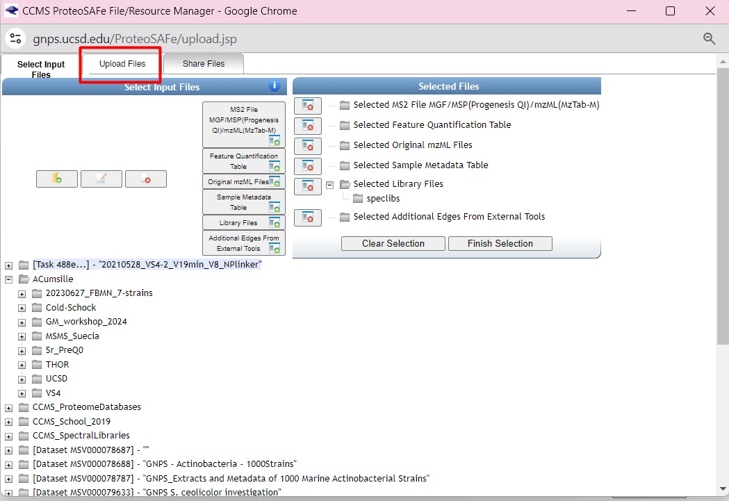
Figure 30
Image 1 of 1: ‘FBMN’
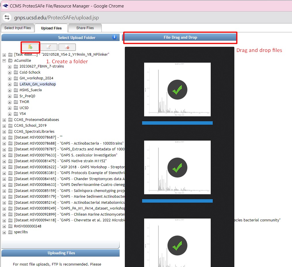
Figure 31
Image 1 of 1: ‘FBMN’
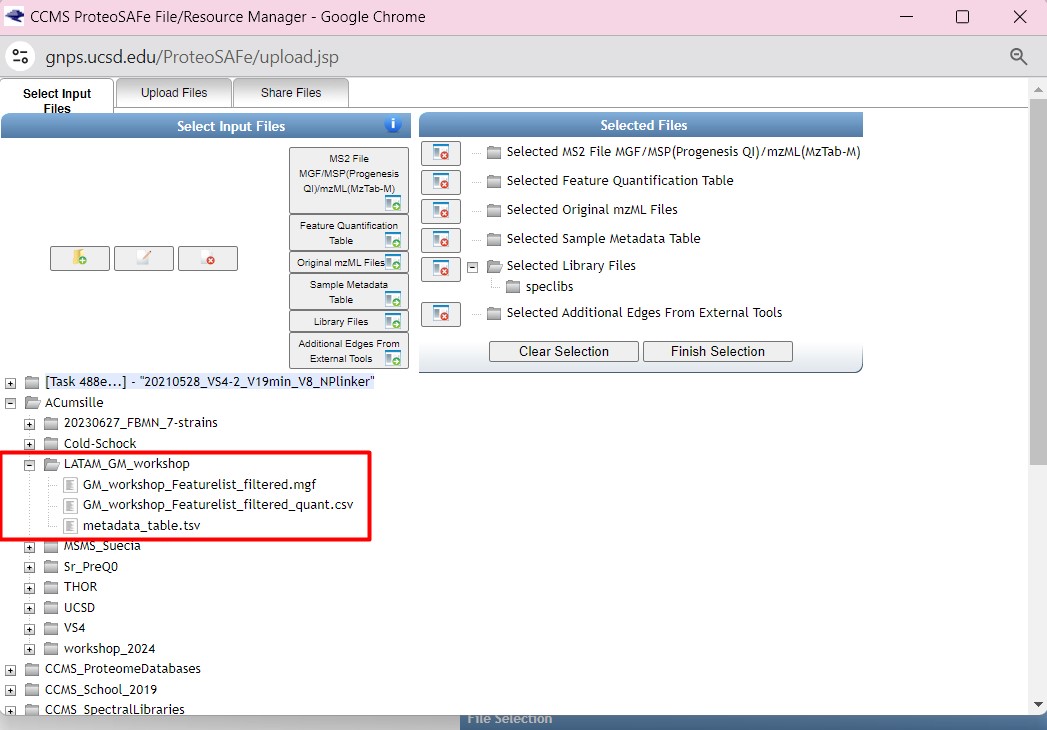
Figure 32
Image 1 of 1: ‘FBMN’
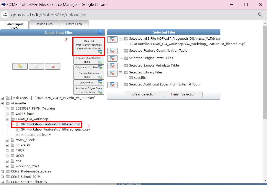
Figure 33
Image 1 of 1: ‘FBMN’
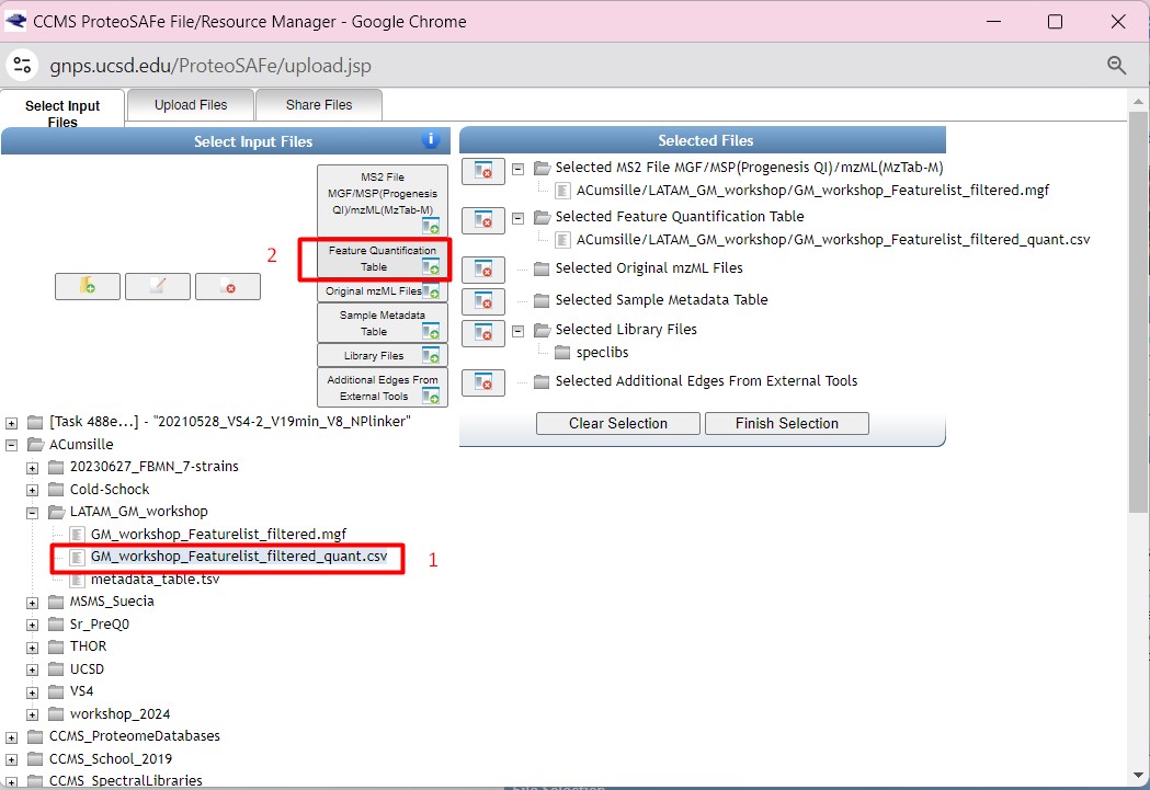
Figure 34
Image 1 of 1: ‘FBMN’
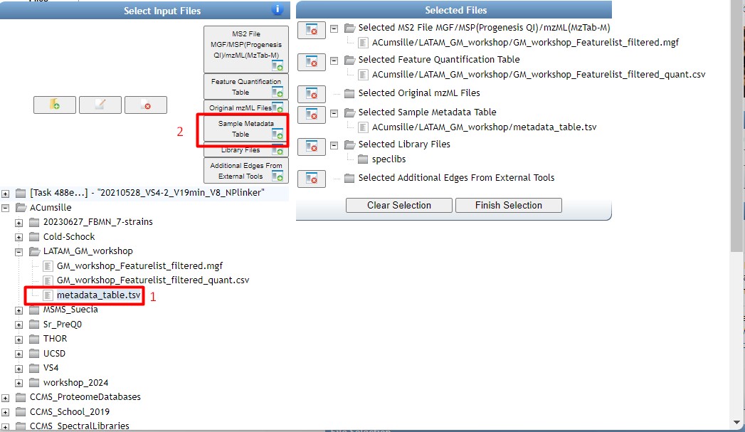
Figure 35
Image 1 of 1: ‘FBMN’
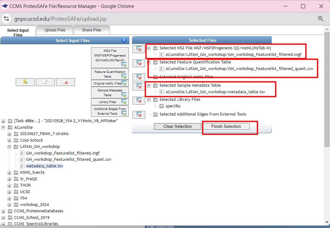
Figure 36
Image 1 of 1: ‘FBMN’
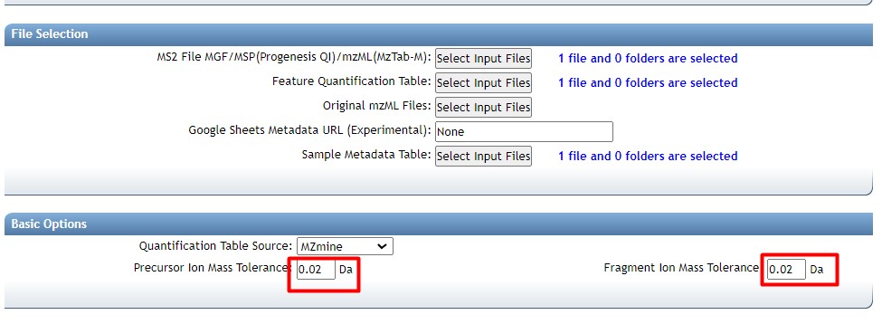
Figure 37
Image 1 of 1: ‘FBMN’
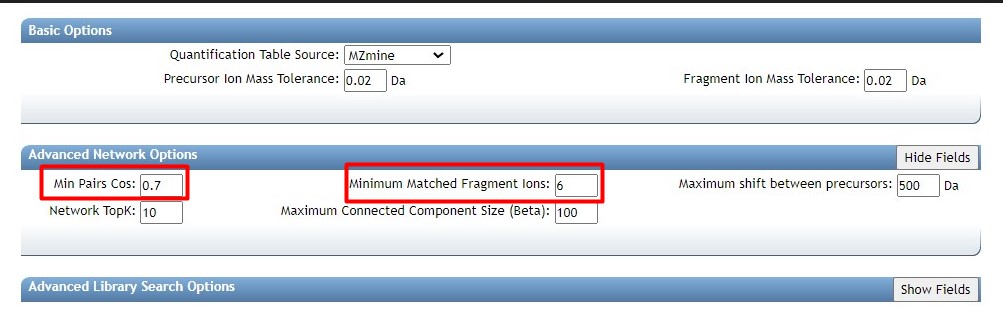
Figure 38
Image 1 of 1: ‘FBMN’
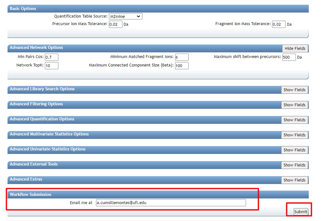
Figure 39
Image 1 of 1: ‘FBMN’
Figure 40
Image 1 of 1: ‘FBMN’
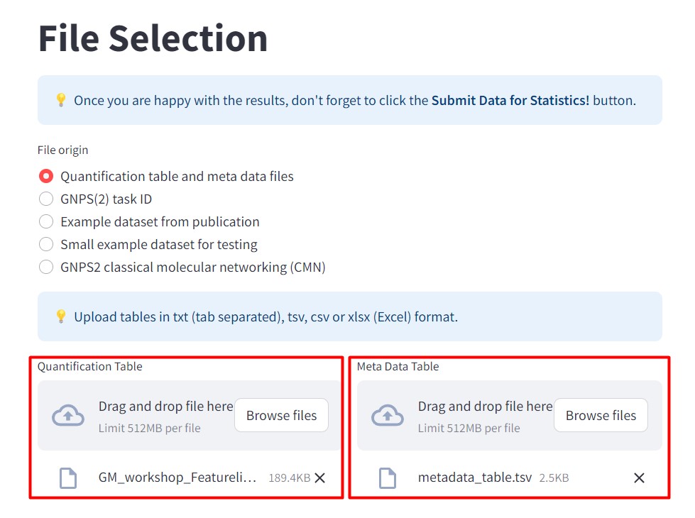
Figure 41
Image 1 of 1: ‘FBMN’
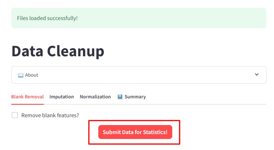
Figure 42
Image 1 of 1: ‘FBMN’
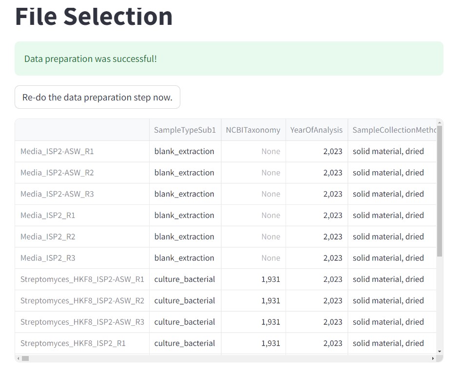
Figure 43
Image 1 of 1: ‘FBMN’
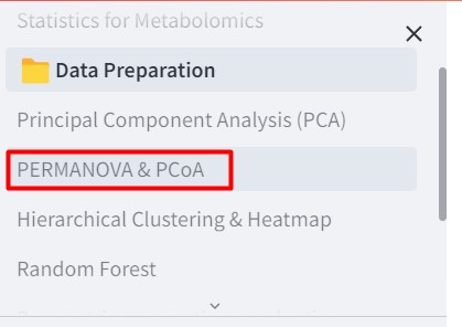
Figure 44
Image 1 of 1: ‘FBMN’
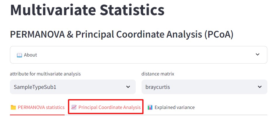
Figure 45
Image 1 of 1: ‘FBMN’
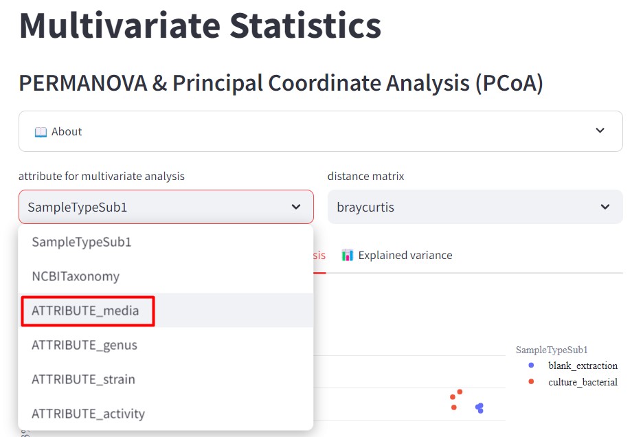
Figure 46
Image 1 of 1: ‘FBMN’
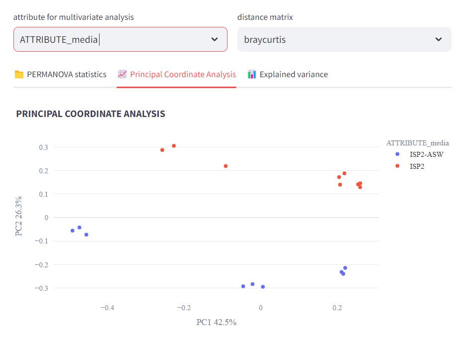
Figure 47
Image 1 of 1: ‘FBMN’
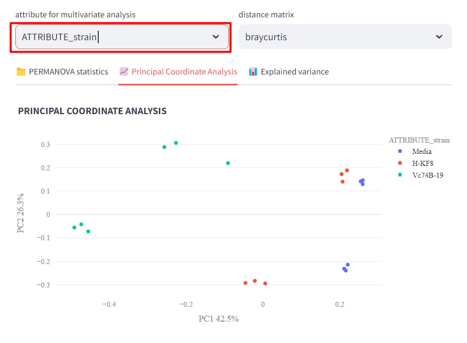
Figure 48
Image 1 of 1: ‘FBMN’
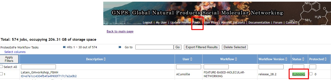
Figure 49
Image 1 of 1: ‘FBMN’
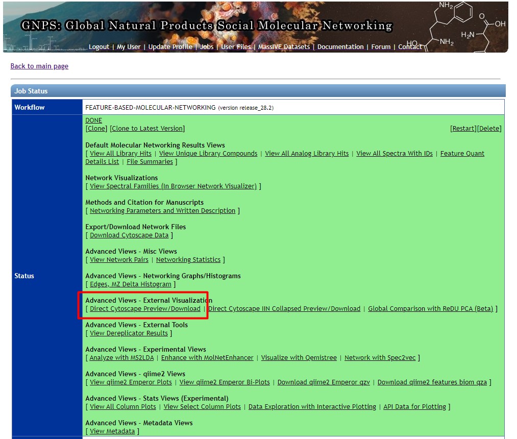
Figure 50
Image 1 of 1: ‘FBMN’
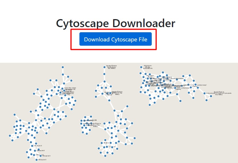
Figure 51
Image 1 of 1: ‘FBMN’
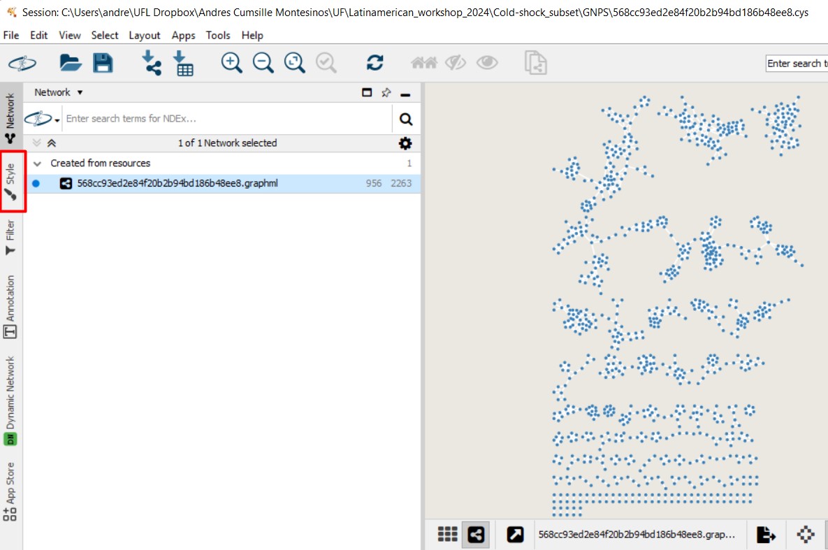
Figure 52
Image 1 of 1: ‘FBMN’
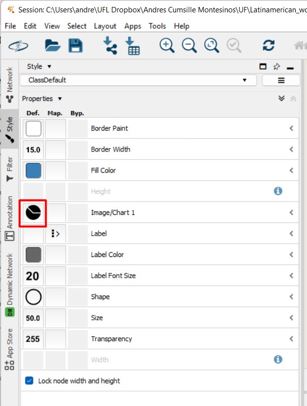
Figure 53
Image 1 of 1: ‘FBMN’
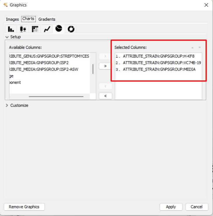
Figure 54
Image 1 of 1: ‘FBMN’
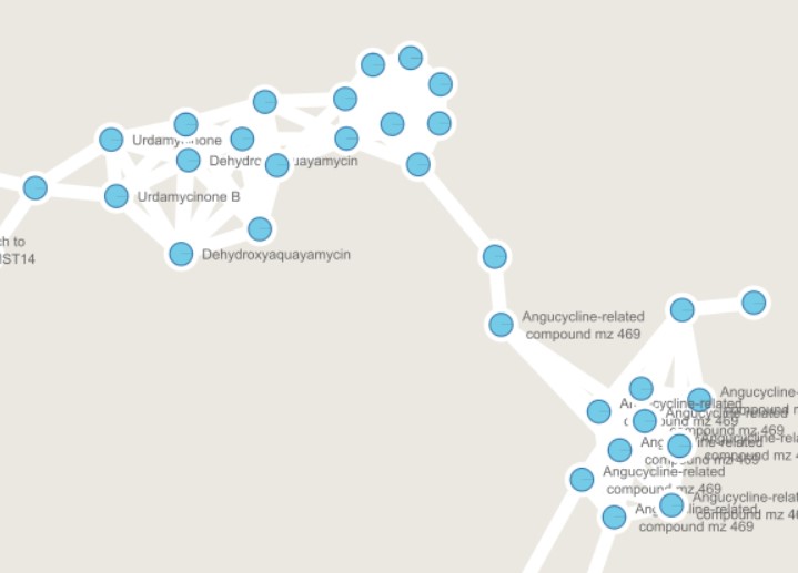
Figure 55
Image 1 of 1: ‘FBMN’
Figure 56
Image 1 of 1: ‘FBMN’